library(httr)
library(here)
library(janitor)

#read in and store the variables you have just created for your API keys
source("keys.r")

# Page size (max 5000)
query_size <- 5000

#I am using the Here package to put the CSV downloaded into a specific folder inside the current here() route - you will probably want to put yours somewhere else. Check there here package for details on how this works.
output_file <- here("output.csv")

# Base url and example query parameters
base_url <- 'https://epc.opendatacommunities.org/api/v1/domestic/search'

#this parameter specifies a particular local authority - this is Mid-Sussex
query_params <- list(size = query_size, `local-authority` = 'E07000228')

# Set up authentication
headers <- c(
  'Accept' = 'text/csv',
  'Authorization' = epc_auth
)

# Keep track of whether we have made at least one request for CSV headers and search-after
first_request <- TRUE
# Keep track of search-after from previous request
search_after <- NULL

# Open a connection to write to the output file
file_conn <- file(output_file, "w")

# Loop over entries in query blocks of up to 5000 to write all the data into a file
while (!is.null(search_after) || first_request) {
  # Only set search-after if this isn't the first request
  if (!first_request) {
    query_params[["search-after"]] <- search_after
  }

  # Make request
  response <- GET(url = base_url, query = query_params, add_headers(.headers=headers))
  response_body <- content(response, as = "text")
  search_after <- headers(response)$`X-Next-Search-After`

  # For CSV data, only keep the header row from the first response
  if (!first_request && response_body != "") {
    response_body <- strsplit(response_body, "\n")[[1]][-1]
  }

  # Write received data
  writeLines(response_body, file_conn)

  first_request <- FALSE
}

# Close the file connection
close(file_conn)Data Download and Mapping Workshop
This guide will walk you through the process of downloading, geo-coding and then mapping data from The UK Government’s Department for Levelling Up, Housing and Communities (DLUHC) Domestic Energy Performance Certificate (EPC) Data.
Part 1 is a guide to downloading EPC and Ordnance Survey’s geo-referenced Unique Property Reference Number (UPRN) data from two APIs and linking the two datasets for mapping using R.
Part 2 will explain how to load your newly linked data into QGIS and map it, adding additional contextual data from the OS Zoomstack.
If you are not familiar with R and you want to get straight onto the mapping, download this sample dataset via this link and skip straight down to Part 2 - Making Some Sick Maps
Part 1 - Getting the Data
Downloading R and RStudio
To run this tutorial you should download and install both R and RStudio onto your machine. Download and install R before you Download and Install R Studio
Download R from here: https://www.r-project.org/
Download RStudio from here: https://posit.co/products/open-source/rstudio/
If you are unfamiliar with R and RStudio, there are lots of written and video guides out there. Here is an excellent place to start: https://education.rstudio.com/learn/beginner/
Before going any further, make sure you are happy with writing and saving code in .r or .rmd files in a working directory, installing and librarying packages, running basic scripts.
Creating a file to store your API keys
We will be using API keys that you will need to sign up and have an account for.
Visit - https://epc.opendatacommunities.org/ - and sign-up so you can access the data
Once signed up, sign in and wait for the email link to be sent to you to connect to the data interface
Scroll to the very bottom of the Domestic EPC search front page - here you should find your api key, however, click on the developer API key link below that which should take you to this page - https://epc.opendatacommunities.org/docs/api
Click on the Domestic Energy Performance Certificates API link, which should take you to this page - https://epc.opendatacommunities.org/docs/api/domestic
Open a new R Script file in RStudio - here you will save the various API key and token information you will need to access the API. Call this file keys.r and save it to your working directory
Back on the domestic EPC API page, it will give you information about your API username (probably your email address you signed up with) and your API key. It will also give you two authentication tokens. You need to save these in your new keys.r file.
In your new keys.r file, create 4 new variables and assign them the various keys and tokens you have been given, exactly as below (don’t forget the quotation marks!):
epc_user <- “your_email@your_domain.com”
epc_api_key <- “3a9f3fc………………………………”
epc_auth_token <- “YS5kZW……………………….”
epc_auth <- “Basic YS5kZW5………………………”
Save your keys.r file and close it.
Downloading EPC Data using the API
The code below (translated into R - thanks ChatGPT - from the python examples given here: https://epc.opendatacommunities.org/docs/api/domestic) will download all of the data for a particular local authority of interest.
Before running this script, make sure you have installed the three packages that are libraried at the start.
This script downloads data for one particular local authority in the UK - Mid Sussex - code E07000228. If you want to download data for another local authority, simply change the code - https://www.get-information-schools.service.gov.uk/Guidance/LaNameCodes
The API documentation is very good, and you can filter your results not just on local authority, but other spatial variables like postcode - or by any of the variables such as type of property (e.g. bungalow), size of property, EPC rating, when the certificate was lodged - or indeed any combination. Use the API documentation to edit the code below.
Read the CSV file back in to your environment
library(tidyverse)

epc_data <- read_csv(here("output.csv")) %>%
  clean_names()
Get UPRN Data from the OS API
The OS Data Hub has an API which can also be used to download various Open and licence restricted datasets - https://osdatahub.os.uk/ - using the API directly to access the data requires an amount of specialist knowledge (although there is some work in progress documentation here - https://github.com/howaskew/OSapiR), however colleagues at OS have also created an R package called osdatahub - https://cran.r-project.org/web/packages/osdatahub/index.html (versions are also available in Python and Javascript - https://github.com/OrdnanceSurvey/os-api-resources)
Below we use the osdatahub package to download the Open UPRN dataset from the OS servers.
library(osdatahub)
library(zip)
library(tidyverse)

#get a list of the open datasets - uncomment to see
#list_os_opendata()

#we're interested in the OpenUPRN dataset, so get all of the relevant info into an object
uprn = list_os_opendata('OpenUPRN')

#opening up the object, can see that we want the csv, which is the first entry
uprn$fileName[1]
[1] "osopenuprn_202402_csv.zip"#now we can download it:
download_os_opendata(uprn,
file_name = uprn$fileName[1],
output_dir = tempdir())
#get the path to the zipfile you have just downloaded
zip_file <- file.path(tempdir(), uprn$fileName[1])
#find out what the name of the csv is within the zipfile
zip_contents <- zip_list(zip_file)
zip_contents$filename[3][1] "osopenuprn_202402.csv"csv_file <- zip_contents$filename[3]
# Unzip the file
unzip(zipfile = zip_file, exdir = tempdir())
# Read data from the CSV file
uprn_data <- read_csv(file.path(tempdir(), csv_file)) %>%
clean_names()Joining EPC data to UPRN data and cleaning for mapping
First we will get some Local Authority Boundaries from the Office for National Statistics to ‘trim’ our EPC data with. Sometimes, due to errors in UPRN address matching, some properties are outside of the local authority we are interested in, so we need to drop these from our analysis dataset (we could try to fix, but this will take too long in this example so we’ll just drop them).
Visit the ONS Geoportal website - https://geoportal.statistics.gov.uk/ - and navigate to a recent set of Local Authority District Boundaries - we’ll go for the ones that are ‘Full extent of the realm and clipped (BFC)’ - at the time of writing, the latest available are from 2023, so we’ll use those.
If you click on the dataset, you should be presented with a map page - for example, like this: https://geoportal.statistics.gov.uk/datasets/2f0b8074b6ab4af6a1ec30eb66317d12_0/explore?location=54.959083%2C-3.316939%2C6.21
At the bottom of the page, clicking on the “I want to use this” button reveals - under the ‘View API Resources’ button - a URL to a GeoJson file that you can download. You can copy this and paste it in the code as below
Be warned - occasionally the URL strings to these files change and the files themselves break. If this happens, try again with another dataset - perhaps from a different year or month. Eventually you should find one that works.
library(geojsonsf)
library(tmap)
The legacy packages maptools, rgdal, and rgeos, underpinning the sp package,
which was just loaded, were retired in October 2023.
Please refer to R-spatial evolution reports for details, especially
https://r-spatial.org/r/2023/05/15/evolution4.html.
It may be desirable to make the sf package available;
package maintainers should consider adding sf to Suggests:.Breaking News: tmap 3.x is retiring. Please test v4, e.g. with
remotes::install_github('r-tmap/tmap')#download some local authority boundaries from the ONS Geoportal
LAD_sf <- geojson_sf("https://services1.arcgis.com/ESMARspQHYMw9BZ9/arcgis/rest/services/Local_Authority_Districts_May_2023_UK_BFC_V2/FeatureServer/0/query?outFields=*&where=1%3D1&f=geojson") Warning in readLines(con): incomplete final line found on
'https://services1.arcgis.com/ESMARspQHYMw9BZ9/arcgis/rest/services/Local_Authority_Districts_May_2023_UK_BFC_V2/FeatureServer/0/query?outFields=*&where=1%3D1&f=geojson'#just plot the boundaries quickly to see if they have downloaded OK
qtm(LAD_sf)
# filter for Mid-Sussex again
Local_sf <- LAD_sf %>% filter(LAD23CD == "E07000228")

qtm(Local_sf)
Now we can join some coordinates to our trimmed EPC data to enable us to map it.
#first have a look at the columns within the file. This should tell you that in both files, there are columns called "uprn" - if you haven't cleaned the column headers with janitor, they could be capitalised or something else.
str(epc_data)
str(uprn_data)
#Join the epc_data and uprn_data files together using a left_join() function. Join on the common UPRN identifier. Then, immediately filter out all of the rows without uprns (and therefore coordinates) by piping the newly joined data into a filter function
epc_coords <- left_join(epc_data, uprn_data, by = join_by(uprn == uprn)) %>%
filter(!is.na(uprn))
#now write your new clean, joined data file out to a CSV
write_csv(epc_coords, here("epc_coords.csv"))Mapping Your New Data
It is possible to map your data directly in R, however, in this exercise we are going to eventually map it in QGIS.
We can have a quick glimpse at the data though by converting our new joined dataset into a simple features (sf) object and viewing it.
library(sf)Linking to GEOS 3.11.2, GDAL 3.6.2, PROJ 9.2.0; sf_use_s2() is TRUE#convert the csv with coordinates in it to an sf object
epc_sf <- st_as_sf(epc_coords, coords=c("x_coordinate", "y_coordinate"), crs=27700)
#set the CRS to british national grid
st_crs(Local_sf)Coordinate Reference System:
User input: 4326
wkt:
GEOGCS["WGS 84",
DATUM["WGS_1984",
SPHEROID["WGS 84",6378137,298.257223563,
AUTHORITY["EPSG","7030"]],
AUTHORITY["EPSG","6326"]],
PRIMEM["Greenwich",0,
AUTHORITY["EPSG","8901"]],
UNIT["degree",0.0174532925199433,
AUTHORITY["EPSG","9122"]],
AXIS["Latitude",NORTH],
AXIS["Longitude",EAST],
AUTHORITY["EPSG","4326"]]Local_sf <- st_transform(Local_sf, 27700)
#clip it as some weird places are in the dataset - data errors.
epc_sf_clip <- epc_sf[Local_sf,]#try and map it with tmap
library(tmap)
# set to plot otherwise if you set to view, it will almost certainly crash.
tmap_mode("plot")tmap mode set to plottingqtm(epc_sf_clip)
Part 2 - Making Some Sick Maps
QGIS
- First, download and install QGIS from the QGIS website for whatever operating system you have on your computer.

- Once you have downloaded and installed QGIS, run the program and open up a new blank project
![]()
OS Open Zoomstack - Connecting for Basemap Data
The following information has been reproduced from this PDF on the OS website -
We will need the Vector Tiles Reader plugin to allow us to get some data from OS Open Zoomstack.
Go to Plugins > Manage and Install Plugins from the top drop down menu

Search for Vector Tiles Reader and click the button at the bottom right to install it for use in QGIS

Go back into the main project window and select Vector > Vector Tiles Reader > Add Vector Tiles Layer… from the top menu
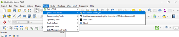
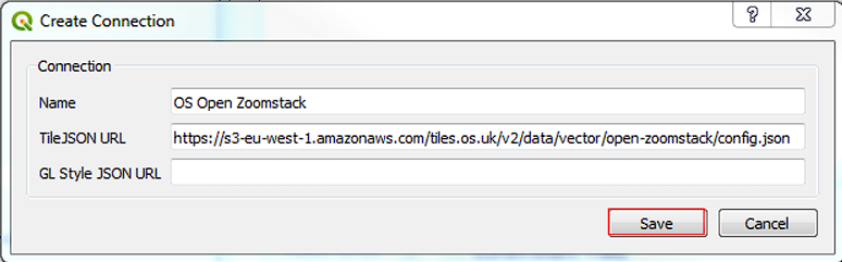
In the dialogue box, click on the Server tab and then click on ‘New’

In the create connection dialogue box paste the URL below into the TileJsonURL box:
https://s3-eu-west-1.amazonaws.com/tiles.os.uk/v2/data/vector/open-zoomstack/config.json
Give it a name such as ‘OS Open Zoomstack’ and Click Save
Find your new ‘OS Open Zoom’ Stack connection in the server tab and click Connect

In the new dialogue box that pops up click on the top layer and then holding shift use the down arrow to highlight every layer in the box. Click the base map defaults button at the bottom and then the Add button
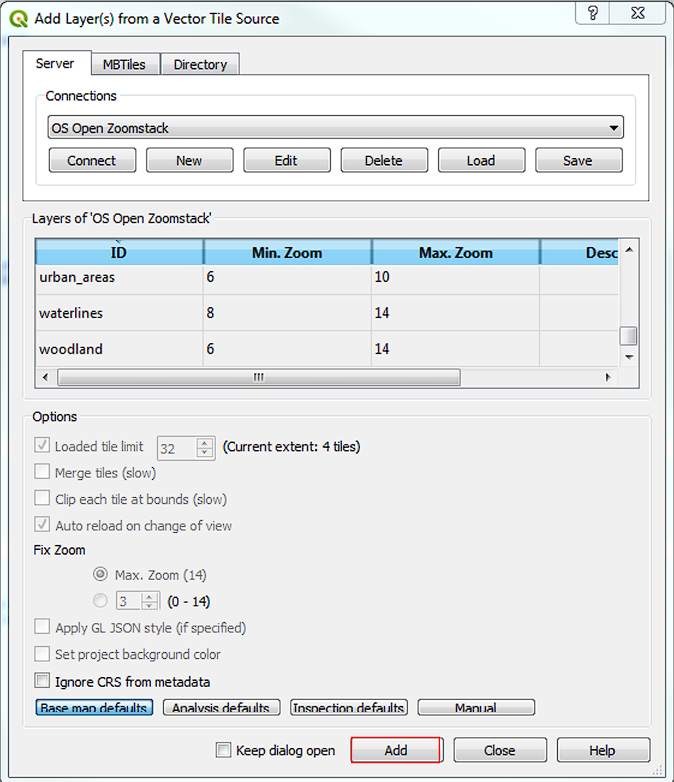
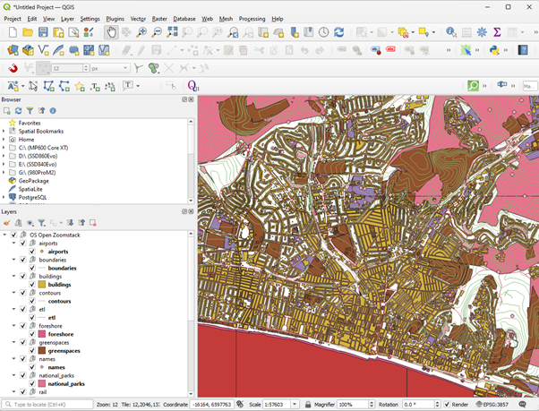
This should then add all zoomstack layers to your map
Importing your EPC Data and Creating a New Points Dataset
Whether you ran the scripts in Part 1 of this guide or downloaded my pre-made dataset, you should have a file called epc_coords.csv stored somewhere on your computer.
We need to import this file using the QGIS Data Source Manager - whatever you do, don’t just try and drag this .csv file straight into the layers window in QGIS. It will let you do it, but it will import every column in your table as text data - which will cause us all kinds of problems later on.
Click on the data source manager icon -
 or find it under Layers > Data Source Manager from the top dropdown menu.
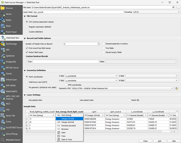
Something like the box above should appear. In the left-hand icon menu, select ‘Delimited Text’ as we will be loading a .csv (comma separated/delimited variables) text file.
At the very top of the window, click the three dots (…) in the top right hand corner and navigate to wherever your epc_coords.csv file is stored.
There are a few little bits of housekeeping you now need to take care of before clicking the Add button at the bottom, or your data will not load in correctly.
Firstly we are going to plot the houses in the EPC dataset as Points on a map. In order to plot these points, you need to tell QGIS, firstly that you want it to plot points, and secondly, which columns to get your points from.
Under ‘Geometry Definition’, make sure that the radar button for ‘Point Coordinates’ is selected. Then, you need to choose the correct columns in your data for the x and y coordinates. You actually have two sets of x and y coordinates you could use. The columns labelled x_coordinate and y_coordinate are self-explanatory and contain Projected British National Grid Eastings (x) and Northings (y) - if you use these columns as in the example above, make sure your Geometry CRS is set to “EPSG: 27700 - OSGB36 / British National Grid”
You also have latitude (y) and longitude (x) that you could use to plot your points, but these are in the global Geographic coordinate system known as WGS84 (EPSG 4326) so if you select these columns, you will need to change the Geometry CRS accordingly.
The final piece of housekeeping that is required is to make sure that all of the columns you import from the CSV are imported as text and numbers (either whole integers or decimal points) correctly.
To do this, at the very bottom of the window, you will see an example of the data that will be imported, with the column header (which hopefully will have been automatically detected by QGIS - if not, you may need to edit under the Record and Fields options). Below the column header is the type of data that QGIS thinks your data is - probably either Text (String), Integer (32 bit) or Decimal (double) - you may also have some Date values too.
Move the slider along and check that all of the data types match the data below - QGIS may have guessed some numbers are text, for example - this is probably where missing values have been stored as “NA”. Where this happens, simply click the small arrow next to the data type and change it to the correct type - usually Integer or Decimal. Do this for all incorrect columns (there will be a few). Anything that is a count or a proportion should be a number. If you’re not sure, you can always open your CSV in excel first to check - but never save it afterwards as excel will cause you even more problems.
Once you have corrected all of the fields that will be read in, click the “Add” button in the bottom right of the window. At this point, you might get a window that pops up explaining that QGIS is going to try and convert your data to another coordinate system. This is fine, just leave it on the default and click “OK”.
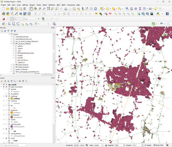
Close the data source manager and you should see a large number of points plotted in your main window.
Creating Your Map
Basic Plotting of EPCs and Contextual Information
We can now begin to build our map of domestic energy performance for any town or village in our study area - you could look at the whole study area too, but there are a lot of data points, so zooming in might be best at this stage.
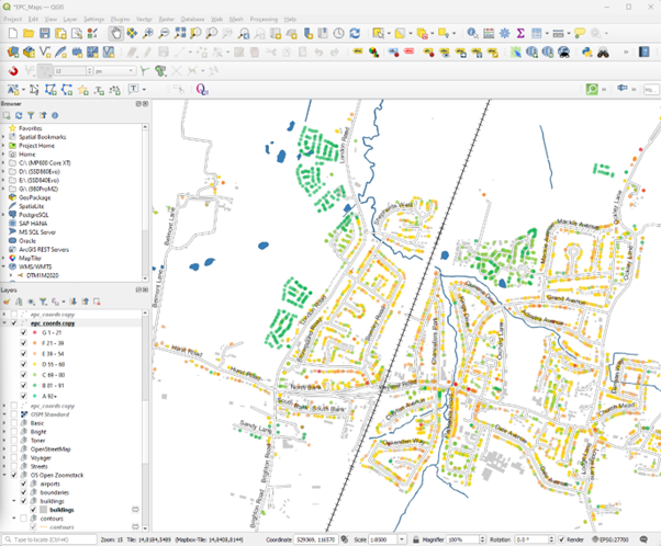
In the Layers panel on the left of QGIS, your epc_coords layer should be on the top, if it is not, you can simply left-click and drag it to the top.
Right Clicking on your layer will allow you to zoom to your layer if you can’t find it on your map.
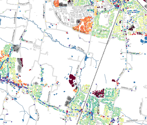
At this point you can add some contextual information from OS Zoomstack. You may already have all layers showing, so un-tick most of them and perhaps just leave information such as buildings, railways, water and roads. Your resulting map may look a little like the one below:
Mapping EPC Variables
Now you have your data loaded, we can explore some of the different variables in the EPC dataset. Let’s start with Age.
Before we get any further, you should download the QGIS Style File for EPC Building Age Categories - EPC_Building_Age_Categories.qml - from here: https://github.com/adamdennett/EPC_Analysis_Website/tree/master/qgis_epc_styles. Save that file (and all of the others in the folder too, if you wish), to a suitable location on your hard-drive.
Now, right-click the epc_coords layer and click on Properties

When the layer properties window opens, select symbology from near the top of the left-hand menu.
When the symbology window opens, at the very top, select Categorised as we are going to give different categories a specific colour value.
In the Value drop down menu, find the variable construction_age_band and select it.
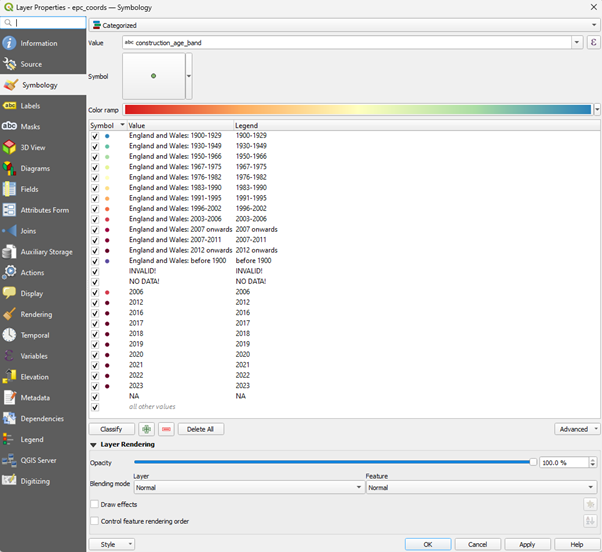
Now at this point you could choose your own Colour Ramp, number of categories etc, but this can be a little time consuming. To save time, we can load the QGIS Style file I created and apply it to your data.
At the very bottom of your layer properties window is a small menu button labelled Style - click Load Style and the Database Styles Manager will pop up.
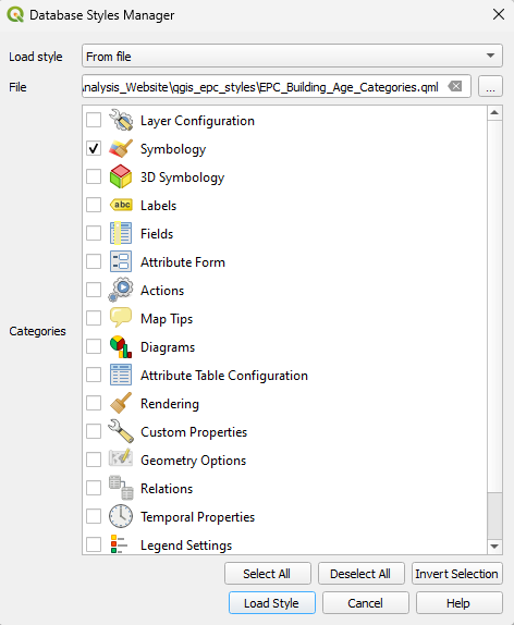
Find the EPC_Building_Age_Categories.qml file you recently downloaded - make sure you only have ‘Symbology’ ticked and then click the Load Style button.
The various messy age categories will now be coloured in roughly spectral order from oldest to newest - with missing ages coloured transparently
Mapping Other Variables
Now you have a basic age map, you can try mapping any of your other variables.
Any Numeric Variables you can map using a Graduated Colour scheme from the top dropdown in the symbology menu. Any text variable can be mapped with a Categorised colour scheme.
We can map energy efficiency with both as there are both numeric (current_energy_efficiency) and text (current_energy_rating) variables for energy efficiency.
Selecting the numeric current_energy_efficiency variable and the graduated colour scheme, we can colour the values according to set ranges and colours by choosing:
- a colour ramp of your choice (below is Magma)
- a number of classes to group by (7 have been selected below)
- a way of choosing the bin sizes for the group (I’ve chosen Jenks Natural Breaks below)
after choosing these options, clicking the Classify button will bin all of your data into the chosen number of classes and colour according to the colour ramp you have chosen, as below.
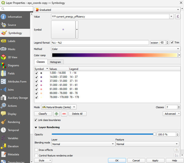
Click the Apply and OK buttons to see your map.
You can experiment with an almost infinite combination of different variables, ranges, ramps and colour schemes. Try some out for different variables in the dataset. You may find that for categorical variables, you have to manually adjust some of the colours and values.
If you want to find out more about playing with symbology, QGIS has some excellent documentation here: https://docs.qgis.org/3.34/en/docs/training_manual/basic_map/symbology.html
I have created a QGIS Style File which styles the current_energy_efficiency variable according to the values and colours used in the EPC certificate rating - download it from here: https://github.com/adamdennett/EPC_Analysis_Website/tree/master/qgis_epc_styles and load in the same way as you did before to map the style to your variable
Making Your Map Sick!
- You may have noticed that my map above still looks a bit different to your map. This is probably because you’ve not styled your OS Open Zoomstack data yet.
Styling your Roads
Styling your contextual data is done in exactly the same way as styling your EPC Point data. First, right-click a layer you are interested in and slected the Properties option. Your Road layer is a good place to start
Your Zoomstack data has variables associated with the feature, so, for example, for your roads layer, you could classify your roads by type and colour them in accordingly:
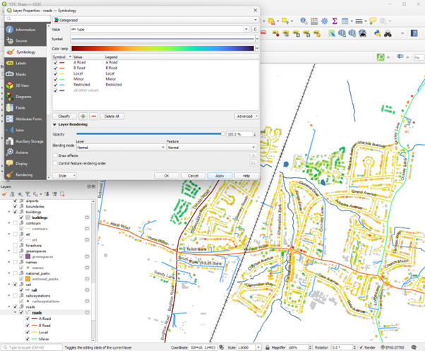
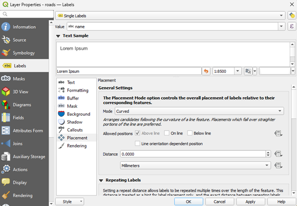
- You can also add labels like the road name to your roads layer using the labels menu in Properties, and selecting the name variable, for example:
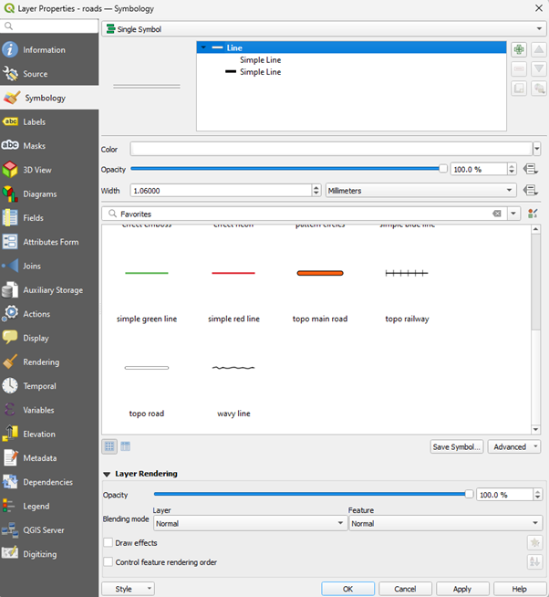
- For my map, I’ve chosen to use the default topo road symbol which is available under the single symbol options.
Buildings, Rail and Surface Water
You can style your buildings, railway lines, surface water - or indeed any of the other variables in the zoomstack data in a similar way using the symbology options.
The ordnance Survey also have some QGIS stylesheets for Zoomstack that you can download and use if you wanted to be very adventurous - https://github.com/OrdnanceSurvey/OS-Open-Zoomstack-Stylesheets
Finishing and Saving Your Map
Once you are happy with your map, you should first save your Project to a safe place on your machine via Project > Save As from the top drop down menu.
You are now ready to finish your map with the Print Layout Manager
Print Layout
Adding, moving and rescaling your map
- Under Project in the top menu, select new Print Layout
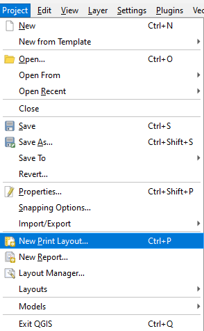
You will be prompted to give your print layout a name, so do this and click OK
For a detailed guide on how to use the print layout, visit the QGIS pages here: https://docs.qgis.org/3.34/en/docs/training_manual/map_composer/map_composer.html - but below we will learn the basics.
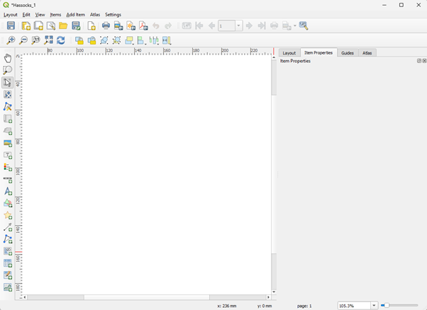
A layout window like the one below should open
- To add your map, you will need to either click the Add Map icon on the left or select it from the Add Item Dropdown menu

- You will then be able to drag a rectangle onto the blank canvas and your map should appear inside it
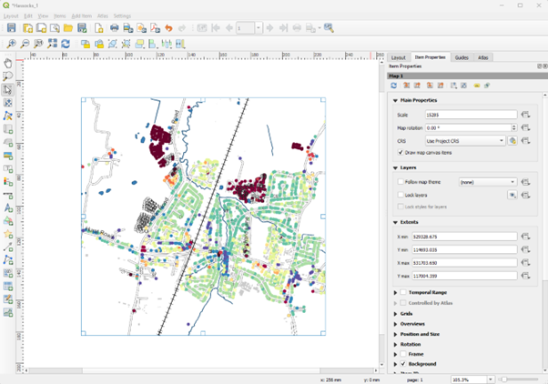
You can resize your map either by typing a new scale value into the scale box on the right, or zooming in or out of your live map back in the main QGIS window.
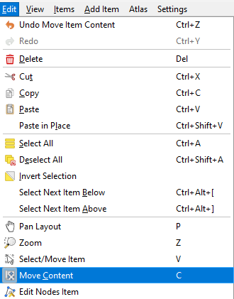
You can move your map around using the Edit > Move Content button and then just clicking and dragging your map
Adding and Editing a Legend
Using Add Item > Legend you can add a legend that will contain all of the layers in your main map
On the right-hand side under Item Properties, untick the ‘Auto Update’ box and then by highlighting elements of the legend you don’t want any more, these can be removed with the red minus button or re-ordered with the arrow buttons
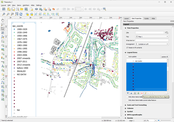
- Items can also be added back in with the green + button. You can also edit the name of your legend with the edit button.
Scale and North Arrow
You can now complete your map with a scale and a north arrow using the same Add Item drop down menu. Various different styles are available.
Note - Your scale will only be in metres or kilometres if you used British National Grid when you imported your CSV data originally.

- When you are happy with your map, you can save it by exporting it as an Image or a PDF via Layout > Export…

- You should also save your Layout Project via the same Layout drop down in case you want to come back and edit again in the future.
Part 3 - Taking the Analysis Further
By this point, you should have some great looking maps which show you the local geography of the energy efficiency (or any other variables you have played with).
This is great descriptive analysis and is always the first stage before asking some more tricky questions
Further Research Questions
- There are lots of further questions you could ask of your data such as:
- What is the average Energy Efficiency of Houses in my town/village?
- Where are the houses that could make the biggest energy efficiency improvements?
Calculating the average energy efficiency for homes in your town/village
To do this, we can take advantage of some of the analysis funcions built into QGIS in the Processing Toolbox
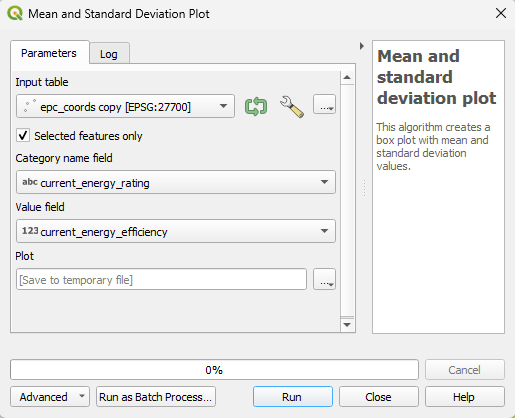
First of all, however, we need to select the buildings we want to include in our analysis. We can do this with the Select Features button at the top of the map window

You can use any of the options that pop up - the top option just allows you to draw a rectangular box, so we will use that for now. If you want something a bit more accurate, the other options will probably work well
Select the tool you want and make sure you have your epc_coords layer selected (clicked on) as the active layer. Draw or drag your selection shape over the area you are interested in and everything within your shape should turn yellow, indicating it has been selected

Now we can run some analysis on the selected properties
If it is not already open, you can open the processing toolbox via the Processing drop-down menu at the top. Once open, expand the tools under Plots and double click on the Mean and Standard Deviation Plot

- In the Mean and Standard Deviation Plot dialogue box, try filling in the parameters as below before clicking Run
- In the results viewer in the bottom right, double click the plot you have just created and it will open up in a web browser on your computer
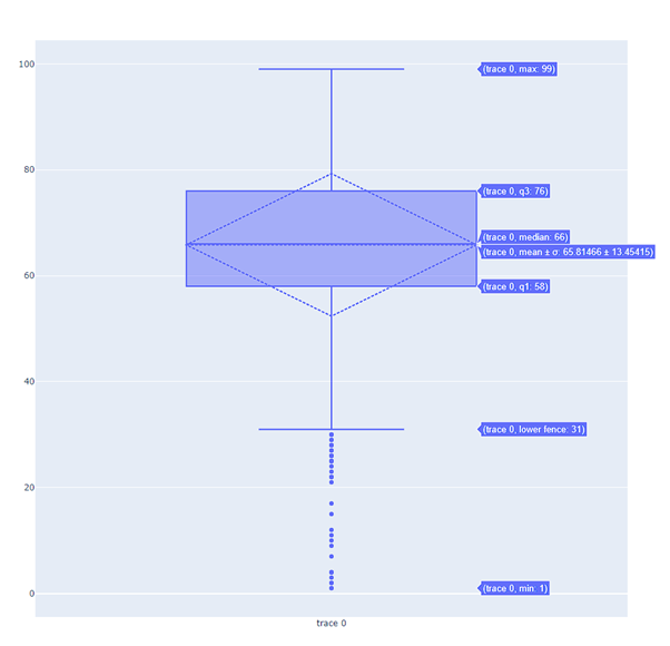
- Hovering over the boxplot will reveal the mean and median EPC values as well as the inter-quartile range (where 50% of the properties fall between) along with some minimum and maximum values.
Where are the homes that could make the biggest energy efficiency improvements?
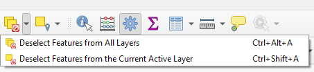
- Before going any further, we need to de-select the features we just selected. Do this using the Deselect Features from All Layers button
To answer this question, we need to calculate a new field which subtracts the values for Current Energy Efficiency from Potential Energy Efficiency. We will call our new variable upgrade_potential
Open the Attribute Table for your epc_coords layer by right-clicking on it and selecting Open Attribute Table
Something like the attribute table below should open:
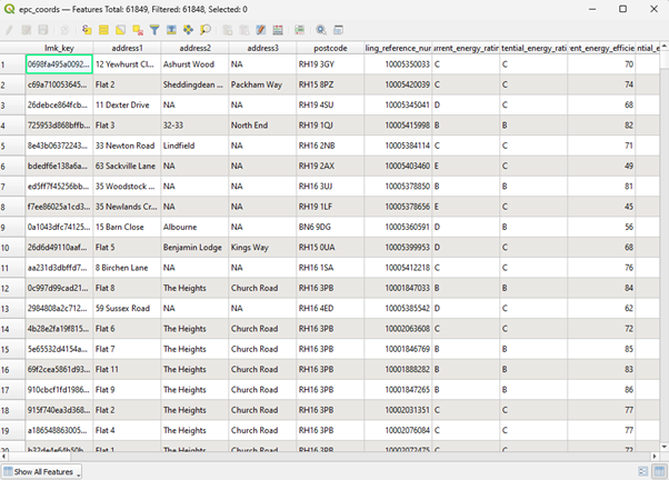
- Click the Open Field Calculator Icon
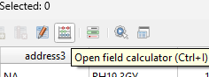
- Fill out the Dialoge Box that opens just like the one below:
Call your Output Field upgrade_potential. We will make it a decimal (double) type. In the expression box, double click the field name for “current_energy_efficiency” first under Fields and Values, insert a minus symbol using the buttons at the bottom and then “potential_energy_efficiency”
When that expression is complete, click OK and a new field called upgrade_potential should be calculated at the end of your epc_coords file.
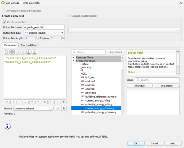
You can now generate a choropleth map of your new variable to see where the places with the most potential for improving their energy efficiency lie
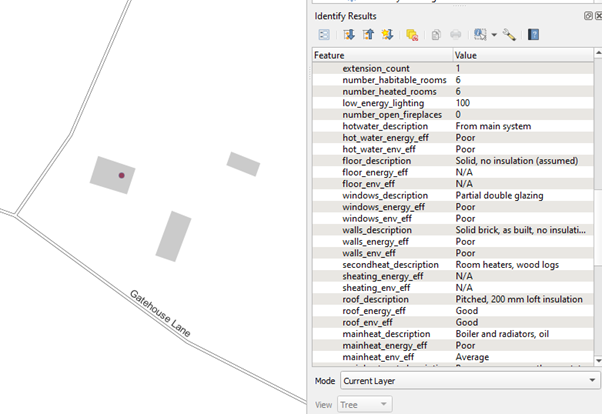
- Using the Information Icon
 we can explore places with the most potential and find out how much they could improve their energy efficiency and what they might do to improve - e.g. Install Double Glazing or are more efficient heating system.