Brighton and Hove Secondary School Admissions Proposal - Week 3 Analysis
Addendum on Educational Performance
As with my last two pieces of analysis (here and here), this is all very much work in progress. Produced very quickly, under a lot of pressure. There will be errors and issues. Hopefully, as with these other pieces of work, this will provide food for thought and I hope the city is given the chance to develop some of these ideas further or at least be better equipped with information than they were before reading.
Brightopia
I’m going to begin this week with a little experiment. Imagine, if you can, a Brighton where all the Secondary Schools are exactly the same. They are all the same size. They are all of the same quality - no more “Outstanding” or “Requires Improvement”. Just the same. All in identikit buildings, with the same allocation of green space. Same teachers. Same school dinners. They are identical in every way. The only difference between them is where they are located in the City. As it happens, they are all located exactly where they are today. Varndean is where Varndean is. Longhill is where Longhill is. Hove Park is where Hove Park is, this is the only thing to differentiate them.
Now imagine that all of the children in the city live where they currently live. But other than that, they are also all identical. Same size families, same levels of income, same religion, etc.
In this slightly weird version of Brighton - an equal Brighton (some might say a “Brightopia”) - which schools would the children in the city choose to attend if the ONLY thing that gave them preference, was how long it took them to get to school either by walking or taking the bus?
If we knew the answer to this question, we might then start to understand what role location and distance plays in the choices people make in the real-life system. And if we know this, we can then compare this “Brightopian” model with the reality we have in Brighton today.
Why is this useful? Well, if we can disentangle the spatial effects on school choice from all of the other effects (how ‘good’ the schools are, religious preference, what the lunches are like, which catchment they are in etc.) we can start to understand what impact things like school catchment areas or perceived quality, are having on the system. Is it the case that people want to go to this school because it is “good” or is it just because it is close to where they live?
A Model of Brightopia
Figure 1 - Location of Secondary Schools (black) and LSOA-level 11-year old populations in the state sector (orange), Brighton, 2024. - Source: Estimates from ONS mid-year small area population estimates of 11-year-olds, 2018-2020 - constrained to Brighton and Hove Council total places 2024 information.
The map above is a real map of Brighton and Hove.
The orange circles represent numbers of 11 year olds in the city in 2024 and where they live - these numbers are taken from the ONS sub-national populations at the city level and distributied down into neighbourhoods according to where the 2021 Census records where they live. While not perfect, this will be a pretty accurate representation of where the children who were going to attend secondary school in 2024 live.
The black dots are the locations of the Secondary Schools in the city and the black boundaries are the current catchment areas surrounding these schools, for context.
You can see in the background for this map, there is also a road network. And if we know roughly how fast people walk and if we have information on the bus network in the city and the bus timetables associated with each bus-stop in the city (to give us an idea of how fast the buses travel), we can generate some pretty good estimates of how long it would take children in the orange circles to get to the black dots.
We can use this information to create a ‘model’ (a simplified version of reality) of Brighton - our “Brightopia” model and we can use this model to help us answer: If the only thing that mattered was how long it took to get to school, which schools would the children in the city choose to attend?
Running the Brightopia model
In my day job, I build these kinds of models all the time. They are called ‘spatial interaction models’ and they are used to understand how people, money, commodities etc. move around in cities. They are used to understand how people get to work, how they get to the shops, how they get to school, where they spend their money and how they make choices about where they go. Supermarket chains use them to predict store revenues, transport companies use them to predict passenger numbers, and urban planners use them to understand how cities work.
The most basic spatial interaction models are sometimes simply referred to as ‘gravity models’. The maths underneath is identical to Sir Isaac Newton’s formula for gravity - the bigger the two objects and the closer they are, the stronger the force between them.
If you would like to understand a little more about the theory and the mathematics behind these models - I wrote an explainer some years ago here - https://rpubs.com/adam_dennett/376877
The model I have decided to run is called a “Production” or “Origin Constrained” model - what this means is that the number of children who can go to each school are constrained to the numbers we know are living in different neighbourhoods in the city.
The numbers actually arriving at schools will vary and reflect demand based only on how long it takes to get to those schools. The effect of distance is controlled by what’s known as a ‘distance decay parameter’ and it controls how fast travel declines with increasing distance.
Distance from home to school is not straight-line distance, but walking or via bus travel times along the real Brighton road network, obtained from Open Street Map. Travel Times are calculated using the R5R package, with bus travel times generated from a GTFS schedule for Brighton (actual bus timetable information and times between stops) from May 2024.
Which schools students decide to go to is then only determined by the time it takes to get to school from where they live and nothing else. This is a simplification of course - in reality, there are many other factors that determine where children go to school - but it is through this simplification that we uncover the importance of space.
I have gone a step further and constrained these numbers to the total PAN of 2560 11-year old places in the council’s published material so what we will end up with are estimates that we can compare with actual PAN numbers to see how close we get.
What does the Brightopia Model tell us?
The model gives us two useful outputs:
- The first the total expected Yr 7 PAN numbers (relative to current PANs) for each school if the ONLY thing that mattered was distance. This will tell us how well arranged schools are in the city relative to the population.
- Estimates of flows from residential areas to those schools - so we can get a better understanding of where children would be coming from to attend the schools in Brightopia
| School | PAN 2024 | Model Estimate | Surplus/Deficit |
|---|---|---|---|
| Varndean School | 300 | 296 | 4 |
| Dorothy Stringer School | 330 | 281 | 49 |
| Longhill High School | 270 | 176 | 94 |
| Blatchington Mill School | 330 | 273 | 57 |
| Hove Park School and Sixth Form Centre | 180 | 322 | -142 |
| Patcham High School | 225 | 234 | -9 |
| Cardinal Newman Catholic School | 360 | 385 | -25 |
| Brighton Aldridge Community Academy | 180 | 173 | 7 |
| Portslade Aldridge Community Academy | 220 | 199 | 21 |
| King's School | 165 | 220 | -55 |
Gravity Model Longhill - Modelled Flows to School (current catchments for reference only)
Gravity Model Varndean - Modelled Flows to School (current catchments for reference only)
Hove Park - Modelled Flows to School (current catchments for reference only)
Observations
The space-only gravity model shows that for a lot of schools in the system, they are pretty well positioned, relative to the populations that they might draw from. Indeed this is not all that surprising given that many people with children will choose residential locations near to schools if that choice is available to them.
Hove Park School, according to the model, could attract 142 more students than it currently is, due to where it is located. Although from the map of the flow breakdown, it is an artefact of the model that it is drawing these from a wide area due to the comparative accessibility of this part of town (the model has to send all students somewhere and accessible places hoover up a larger share).
If distance were the only thing that mattered, Dorothy Stringer would attract 49 fewer pupils than its current PAN. Blatchington Mill, 57 fewer, and Longhill would attract 94 fewer than it currently does. The maps show that Longhill’s location and lack of accessibility means it is only drawing students from a primarily, local area.
What this shows, uneqivocally, is that that many of the observations about Longhill’s declining application and admission numbers in my last piece are not simply down to its performance as many suggest, but a large factor in its problems is its location relative to where children live.
- As it is so far out on its own to the East and as so few pupils live in the vicinity, any pupils it would be getting in excess of this number would be due to non-spatial influences.
Longhill is not in a good location for pupils from Whitehawk. Students in this part of the city are not near any school and the fact they have been forced to attend Longhill rather than a closer school has been terrible for them. Given the number of students in the vicinity of the current Longhill, relative to the number of students in Whitehawk, a utilitarian approach that would reduce travel for the most number of students in the city would be to re-locate the school to the near-East of the city.
What this gravity modelling suggests quite strongly is Longhill would stand a better chance of demographic sustainability if it were re-located, perhaps somewhere to the East of the City, near the General Hospital or the Race Course at the top of Elm Grove. If it were re-located here, it would also stand a much better change of naturally achieving the demographic mix (students from Whitehawk, the ’deans and Hannover would be in the natural geographic catchment for a school here.
Further Work
This is only a very basic gravity model and it can be extended to develop and even more nuanced picture of school supply and demand in the city. I have not got that far yes as this takes time to do properly - and I have not had time. But I would be more than willing to work with the Council to develop some more nuanced spatial interaction models, calibrated against their data, to help derive a decision support tool which would enable a fully evidenced decision to be made on location and capacity of schools. This work could include, for example:
An extended gravity model where the Longhill is re-located to other parts of the city. What would demand look like if it were moved to:
The old COMART site?
A new site at the top of Elm Grove near the General Hospital or Dobbies?
Disused farm/warehouse site at the top of Bear Road?
Or any other potentially viable location.
How might the demographic mix of a re-located Longhill look? From where would it most likely draw it’s students (in the absence of catchments?)
A more complex model to explore what happens when we change the attractiveness of schools according to the kinds of factors that parents and students rank highly? Educational outcomes? SEND provision? Green Space?
A better calibrated model using actual student locations and flow data from the council to explore different
How can spatial interaction be used to better inform an alternative to the current catchments? Do we even need catchments at all or can we come up with a much better solution which incorporates distance and socio-demographic diversity AT THE SAME TIME? What would such a system look like?
I think in the medium term, the council would do well to instigate a commission - and I will happily volunteer to be part of it if they would have me - to look into real useful alternatives to the current catchment system which strike the right balance between the socio-spatial realities of the city and other motivations to improve opportunities for those with the least. It’s clear that the boundaries as implemented in 2008 are not working as intended, so perhaps boundaries and catchments are not the solution at all, and alternatives such as the marginal ballot as suggested by the Sutton Trust are alternatives worth looking into alongside a full range of alternatives. If a balanced view of their efficacy in the specific context Brighton could be developed, then it is more likely that an appropriate long-term solution could be found.
Conclusions
Brightopia is a model - but one which, through simplifying the school system in the city to just its spatial components, allows us to disentangle the role that space and distance plays in school choice, relative to any other factors.
It’s a simple fact that the objection to the council proposals that I have heard over and over and over again is - “we don’t want our children to have to travel long distances to school.” There are so many reasons for why this is the case that have been voiced in the public domain, that I won’t go over them again here. Space/Place/Location matters. It really matters. And to deny this physical fact is akin to claiming the world is flat!
The only lasting sustainable solution to the city’s problems in the school system is one that pays full attention to geographic reality while also considering how this geography interacts with disadvantage and opportunities.
“A Stain on our City” - really?
Since writing this original section, new data has become available - please see the addendum here for an updated version of the attainment analysis - my conclusions below are mainly strengthened, with an edit to the gap analysis which acknowledges a slightly larger gap than below, but digs usefully in to why that is.
The phrase “A Stain on our City” has been in the back of my mind ever since it was used in reference to one of the opening slides that Jacob Taylor produced during the face-to-face consultation meeting on Tuesday 8/10/2024. It is highly a highly charged statement used as an oratorical device in making his case. Somebody pulled him up on the emotive language in the audience. Clearly taking this onboard he then went on to use it again in the People, Overview and Scrutiny Committee Meeting - it can be seen here near the opening of his speech - https://aisapps.mediasite.com/AuditelScheduler/Player/Index/?id=c1841cfa-af61-45cf-85b5-bb8d274e6b75&presID=32ca1cfe29e14291be27a478fdbf76d01d
As a reminder, this is the graph that he was referring to when he made these comments:
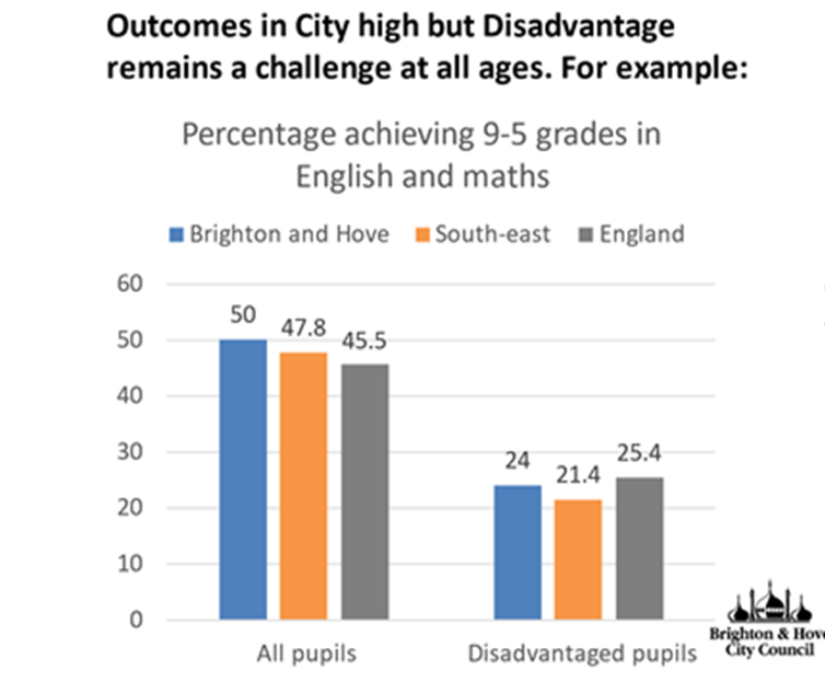
The ‘stain’ in this context is in reference to the 24% of Brighton & Hove’s disadvantaged pupil population getting grade 5 or above in Maths and English. Being below the national figure of 25.4 for England constituted a “stain on our city” in JT’s mind. Strong stuff. Especially considering Brighton seems to be doing better than the rest of the South East region.
But is it really a “stain”, or is there more going on?
Now, of course, comparing these figures with non-disadvantaged pupils, there is clearly a big attainment gap and narrowing this gap must be (and I am sure is) a priority for every local authority in the country. It’s not right that those from disadvantaged backgrounds do so much worse than their more advantaged peers.
What I am not arguing is that a 26% gap is good, I am just questioning how we understand this number - is it big, average or small, compared to elsewhere? The argument Jacob Taylor was employing cast the whole of Brighton as a failure, relative to England, but is it fair to cast Brighton this way and does it serve to distract from where the real problems exist in the system?
Two specific questions arise from this:
Is 24% as bad as is being portrayed if we examine some wider context?
Is the gap between 24% and 50% worse or better than anywhere else in the country?
In answering both of these questions, we can develop a clearer context for Brighton - which is really important as it underpins a lot of the arguments being made by the Council.
Fortunately, the Government publishes data on attainment at age 16 across the country, according to social disadvantage, so we can compare Brighton with a few more examples than just the national average, and the evidence is revealing.
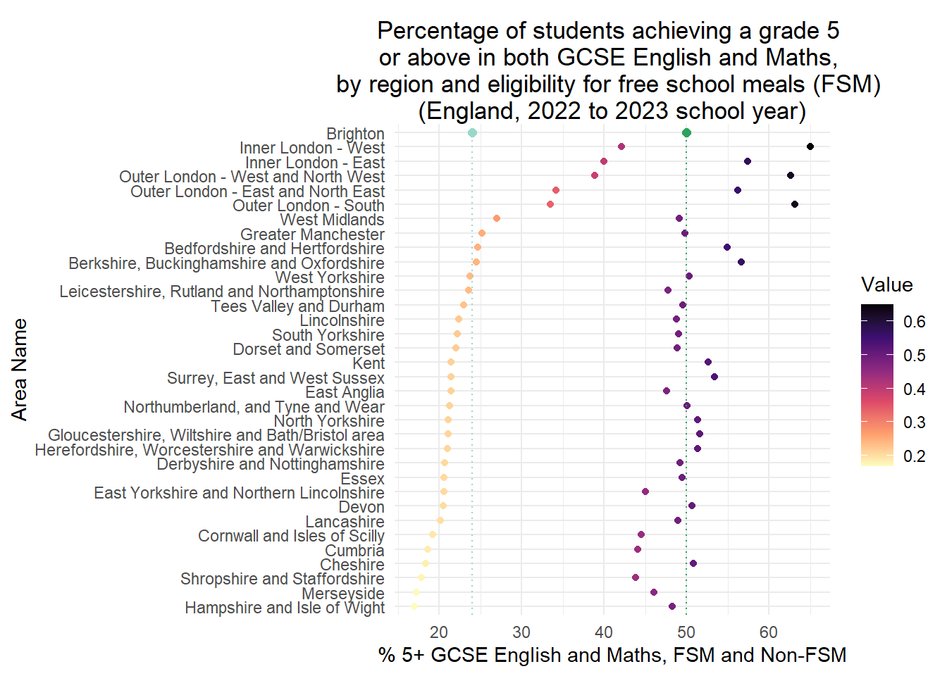
Figure 1 - Percentage of Students achieving Grade 5+ English and Maths, for disadvantaged (those in receipt of Free School Meals - left) and non-disadvantaged (right) students, 2022-23.
There are a few features of note in this graph.
Firstly, there are 33 ‘Regions’ in this version of England. Brighton is within, and contributing to, the value of 21.4% for Surrey, East and West Sussex. Brighton, at 24%, is not only doing better than its wider region, but because it is not excluded from the regional figure, actually pulling its average up.
Secondly, if Brighton were a region on this scale (ranked according to FSM achievement), it would sit between West Yorkshire (23.8% - ranked 10 of 33) and Berkshire, Buckinghamshire and Oxfordshire (24.5% - ranked 9 of 33). In other words, it would fall in the top 1/3 in England.
Thirdly, you may have noticed something interesting at the top of the graph - the top 5-regions that perform considerably better on the attainment of their pupils in receipt of Free School Meals, are all parts of London.
- Indeed London performs a full 10% better than the next ranked region and does a fantastic job of pulling the average up for the rest of the country. Which takes me back to the question I asked in my first piece of work on this topic - why is London doing much better than Brighton and almost everywhere else in the Country? A question I can’t answer here, (although Ellen Greaves and colleagues have some ideas), and one incredibly relevant to this whole issue.
Forthly, without London, the average 5-9 GCSE rate for disadvantaged pupils for the rest of the country reduces to 21%. Against which Brighton is performing much better than average, and if it were one of these regions it would be, in the top 5.
Finally (and it might be easier to read across the table below to see this), the FSM / Non-FSM attainment gap in Brighton, according to the Council’s graph at the top of this piece, is 26%. As you can see in the table below - if Brighton were a region, this would rank 12th on this scale out of 33 - just outside the top 1/3.
Table 1 - Attainment Gap at Age 16, FSM Eligible and Non-Eligible Students, England 33 Regions. Ranked by Smallest Gap
| rank | area_name | fsm_eligible | not_fsm_eligible | gap |
|---|---|---|---|---|
| 1 | Inner London - East | 40.0 | 57.5 | 17.5 |
| 2 | Outer London - East and North East | 34.2 | 56.2 | 22.0 |
| 3 | West Midlands | 27.0 | 49.1 | 22.1 |
| 4 | Inner London - West | 42.1 | 65.0 | 22.9 |
| 5 | Outer London - West and North West | 38.8 | 62.6 | 23.8 |
| 6 | Leicestershire, Rutland and Northamptonshire | 23.6 | 47.8 | 24.2 |
| 7 | East Yorkshire and Northern Lincolnshire | 20.6 | 45.1 | 24.5 |
| 8 | Greater Manchester | 25.2 | 49.8 | 24.6 |
| 9 | Cornwall and Isles of Scilly | 19.2 | 44.5 | 25.3 |
| 10 | Cumbria | 18.6 | 44.1 | 25.4 |
| 11 | Shropshire and Staffordshire | 17.8 | 43.8 | 25.9 |
| 12 | East Anglia | 21.4 | 47.6 | 26.2 |
| 13 | Lincolnshire | 22.4 | 48.8 | 26.4 |
| 14 | Tees Valley and Durham | 23.0 | 49.5 | 26.5 |
| 15 | West Yorkshire | 23.8 | 50.3 | 26.5 |
| 16 | Dorset and Somerset | 22.0 | 48.8 | 26.8 |
| 17 | South Yorkshire | 22.2 | 49.0 | 26.8 |
| 18 | Derbyshire and Nottinghamshire | 20.7 | 49.2 | 28.5 |
| 19 | Essex | 20.6 | 49.4 | 28.8 |
| 20 | Lancashire | 20.1 | 49.0 | 28.8 |
| 21 | Merseyside | 17.3 | 46.1 | 28.8 |
| 22 | Northumberland, and Tyne and Wear | 21.3 | 50.1 | 28.8 |
| 23 | Outer London - South | 33.5 | 63.1 | 29.6 |
| 24 | Devon | 20.5 | 50.7 | 30.2 |
| 25 | Bedfordshire and Hertfordshire | 24.7 | 55.0 | 30.3 |
| 26 | North Yorkshire | 21.1 | 51.3 | 30.3 |
| 27 | Herefordshire, Worcestershire and Warwickshire | 21.0 | 51.4 | 30.4 |
| 28 | Gloucestershire, Wiltshire and Bath/Bristol area | 21.1 | 51.6 | 30.5 |
| 29 | Kent | 21.5 | 52.6 | 31.1 |
| 30 | Hampshire and Isle of Wight | 17.0 | 48.2 | 31.3 |
| 31 | Surrey, East and West Sussex | 21.4 | 53.4 | 31.9 |
| 32 | Berkshire, Buckinghamshire and Oxfordshire | 24.5 | 56.6 | 32.2 |
| 33 | Cheshire | 18.4 | 50.8 | 32.5 |
A Stain on our City? Some Observations
Hopefully what I have shown in this short exercise, is that context is everything.
Compared the the national average for England, Brighton’s attainment at GCSE for pupils on Free School Meals is lower, however, that national average is being pulled up considerably by London, which is performing between 6.5% and 15.1% better than the best-performing non-London region.
If Brighton were one of these 33 regions, it woud still be achieving better results for pupils on FSM than 2/3 of other places in England. If we take London out of the equation, it would appear in the top 5.
Rather than being ‘a stain on our city’, it should be regared as a badge of pride that Brighon and Hove is able to achieve such good results for pupils in receipt of Free School Meals, relative to the rest of England.
If we look at the attainment gap between those who are on Free School Meals and those who aren’t as well, Brighton still performs far better than average, even with London in the equation. If Brighton were one of the regions above, it would be just outside the top 1/3.
The characterisation of Brighton and Hove’s ability to help it’s more deprived students as a ‘stain on the city’ is demonstrably unfair. And this kind of ‘cherry picking’ of statistics (where indeed statistics of any kind have been provided) to suit a particular line of argument has, sadly, characterised this whole ‘engagement’ process.
However, this is even more to it than this. That 24% potentially masks some particularly acute problems in parts of the City such as East Brighton - listening to the Class Divide Podcast, this could be as high as 32% in this part of the city. So ‘stain’ rhetoric when tarring the whole city plays a slightly more insidious role. It serves to distract from the very real problems of access and segretation to do exist in some parts of the city in particular concentrations - particularly in Whitehawk, but also in other parts of the city. Casting it as a problem for the whole city, serves the purpose of diverting attention away from the uncomfortable truth this is really a concentrated problem that needs a specific remedy for a particular part of the city - and not the one that’s on offer. And that in large parts of the city, disadvantaged children are doing better than in 2/3 of the rest of the country.
I know London is an entirely different context in many ways, but we should be striving to achieve something closer to the 42.1% FSM attainment rates achieved in Inner London - West and ignoring where the problems are most acute is not going to be the way to do it. And it absolutely should be in the Council’s mission to improve further, but in doing so, getting a better understanding of the various factors at play in London (demographic, financial, geographical, educational etc.) and the specific routes to success and turnaround is crucial, as then better solutions could be trialled here.
The Importance of Boundaries and distributions of people within them
I would like to thank Bea Taylor for helping me and producing the illustrated account below of the problems of statistical smoothing and the modifiable areal unit problem.
Boundaries - where they are drawn, who’s in, who’s out, are right at the centre of this issue. They are also important as they can be used to make statistics appear better or worse in a given situation.
One additional fear, which I didn’t articulate at the top of this piece in my fears section, is that if the Council propose Option B (or something that looks quite like Option B) one of the justifications they will try to use is “it’s the only option which sees an ‘improvement’ - i.e. more even distribution - in Free School Meals across the catchments.”
However, much of any ‘improvement’ in a situation like this, will be down to statistical smoothing, and in some cases, as the illustration shows below, the priority allocation of FSM places where there is choice in the system, will make things worse for less popular schools - something we are likely to see in Brighton.
Statistical smoothing
Something to watch out for in the options being presented by the council is statistical smoothing. This is what happens when you reduce the number of zones in the city (known as the Modifiable Areal Unit Problem (MAUP)), ‘zones’ here being school catchment areas.
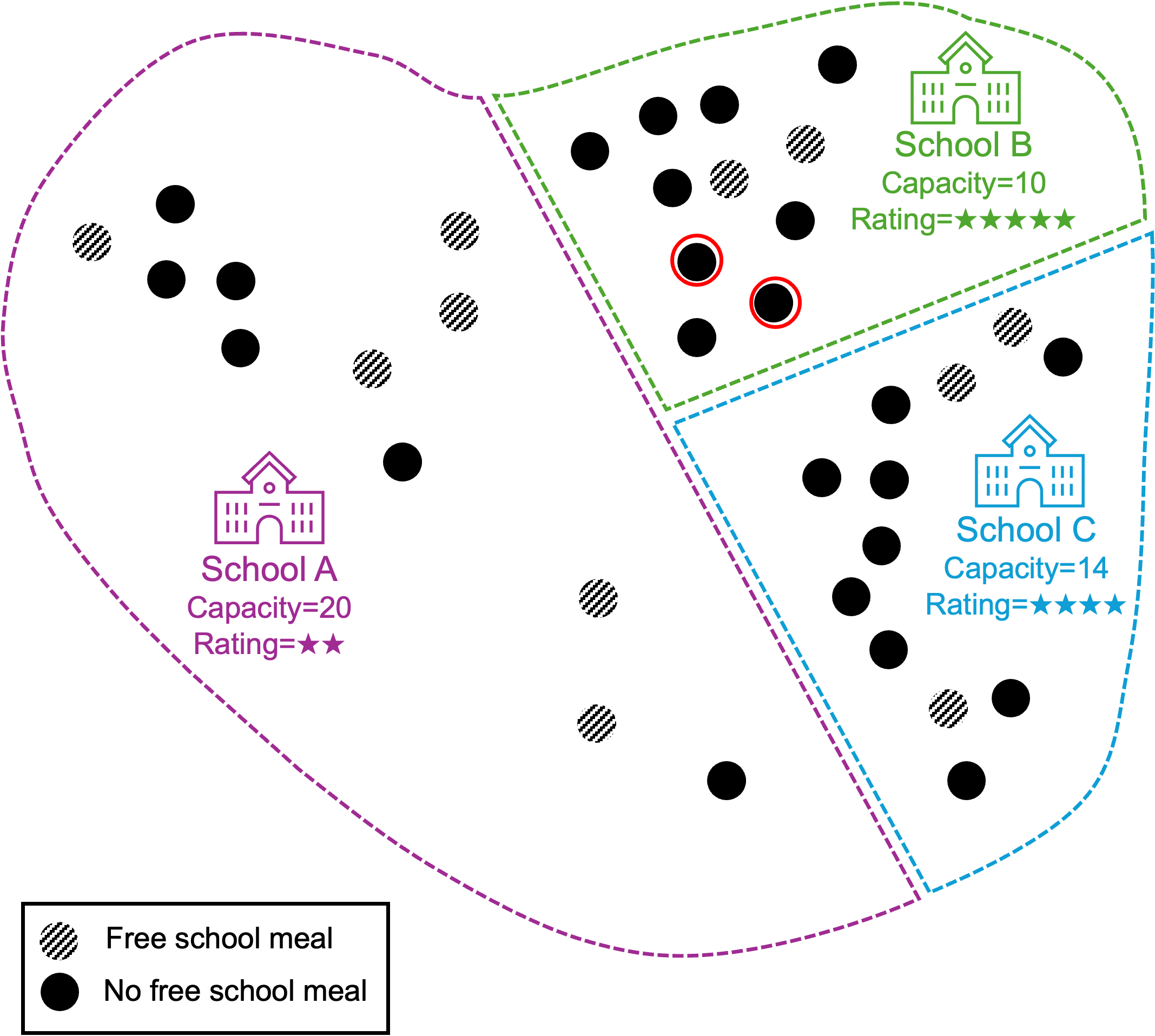
Here’s a simple example to explain. Suppose we have four schools with four catchment areas. Let dots represent pupils, and for simplicity let’s assume that the school caters to all, and only, the pupils in the catchment.
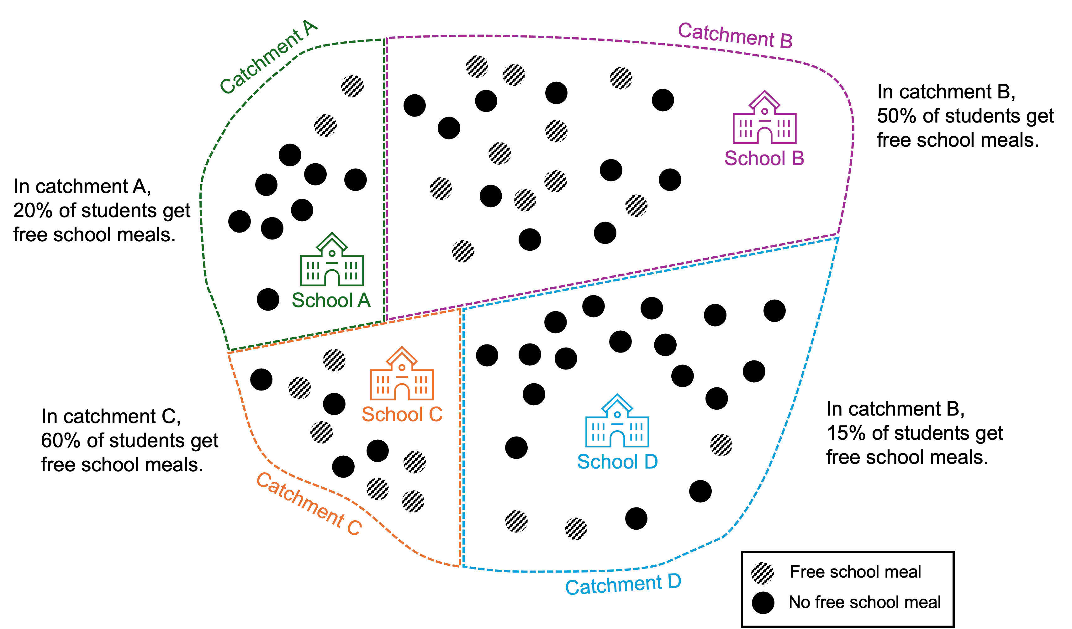
Now suppose the catchments are re-drawn so each catchment area serves two schools, and schools randomly select pupils from the catchment according to school capacity.
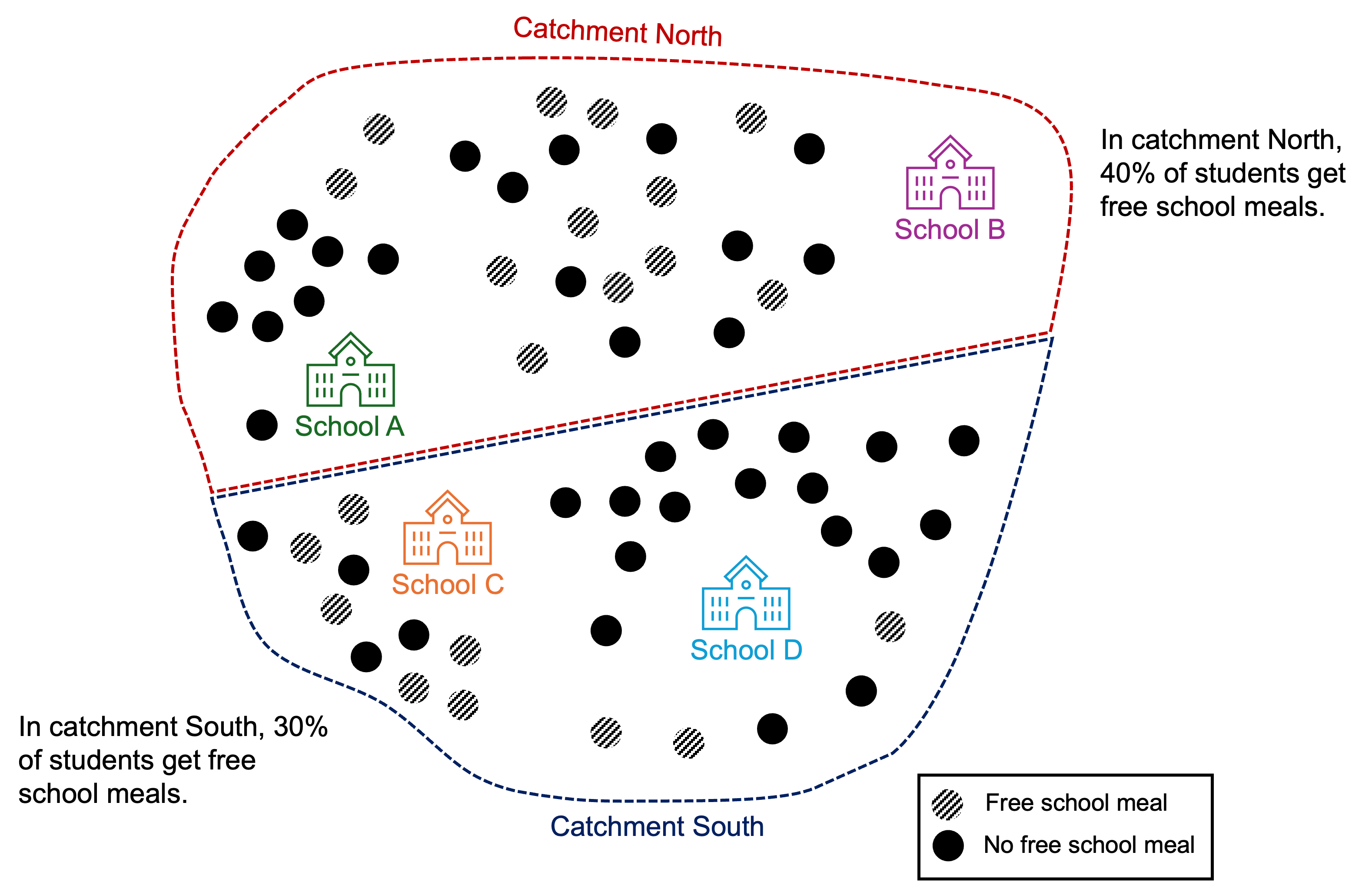
Under the original catchments the % of pupils eligible for free school meals varied from 15%-60% across the schools. Under the new catchments the % of pupils eligible for free school meals varies from 30%-40% across the schools.
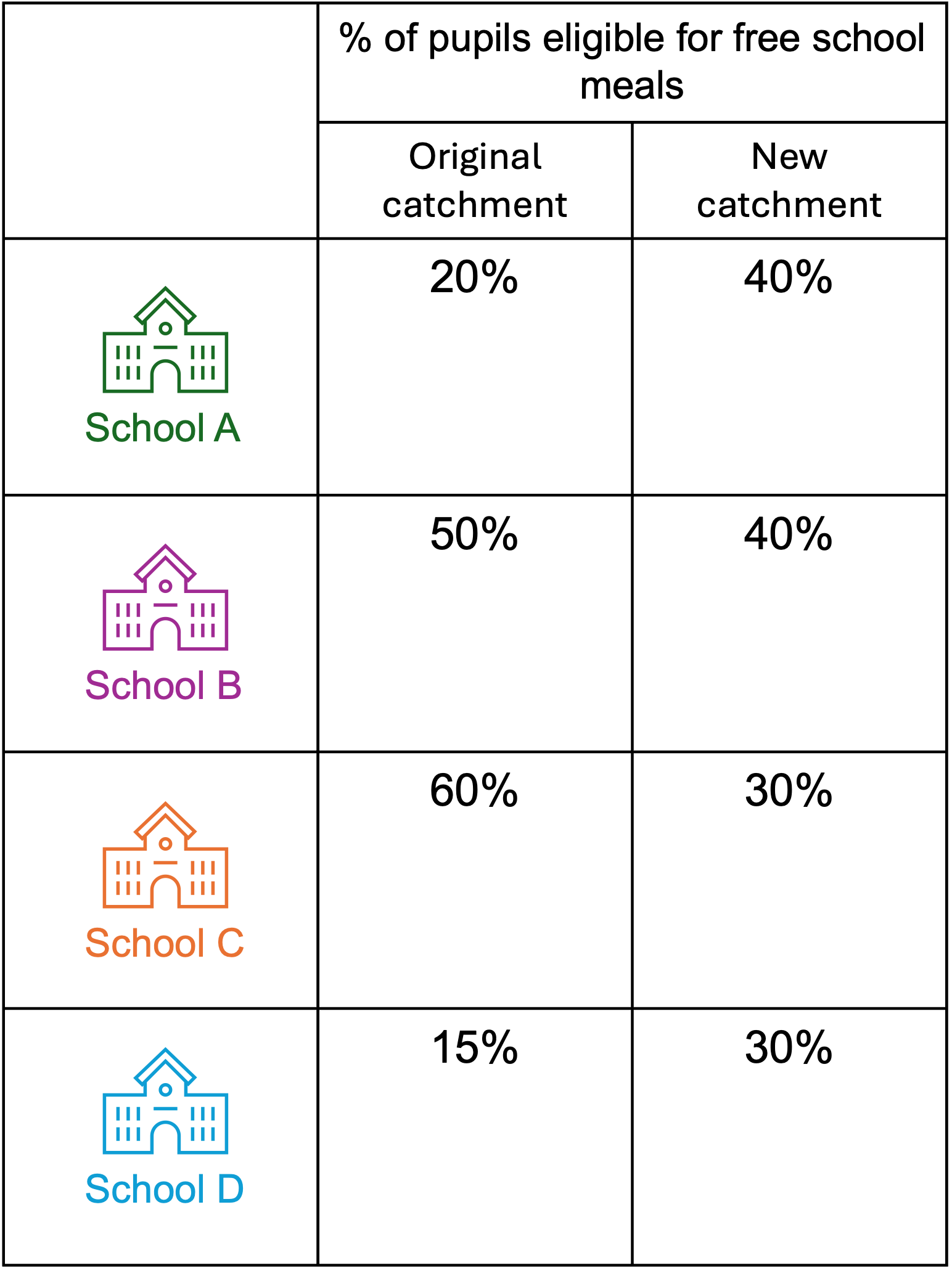
The number of pupils eligible for free school meals has not changed, and the distribution of where these pupils reside in the city has not changed.
The gap in the percentage distribution of pupils eligible for free school meals has shrunk, because all schools have moved closer to the city average for the % of pupils eligible for free school meals.
Something to bear in mind is that these new percentages depend on pupils being chosen completely randomly from the relevant catchment. In reality, rules come into play, for example accommodating siblings at the same school, which mean such a total equality of mixing doesn’t occur.
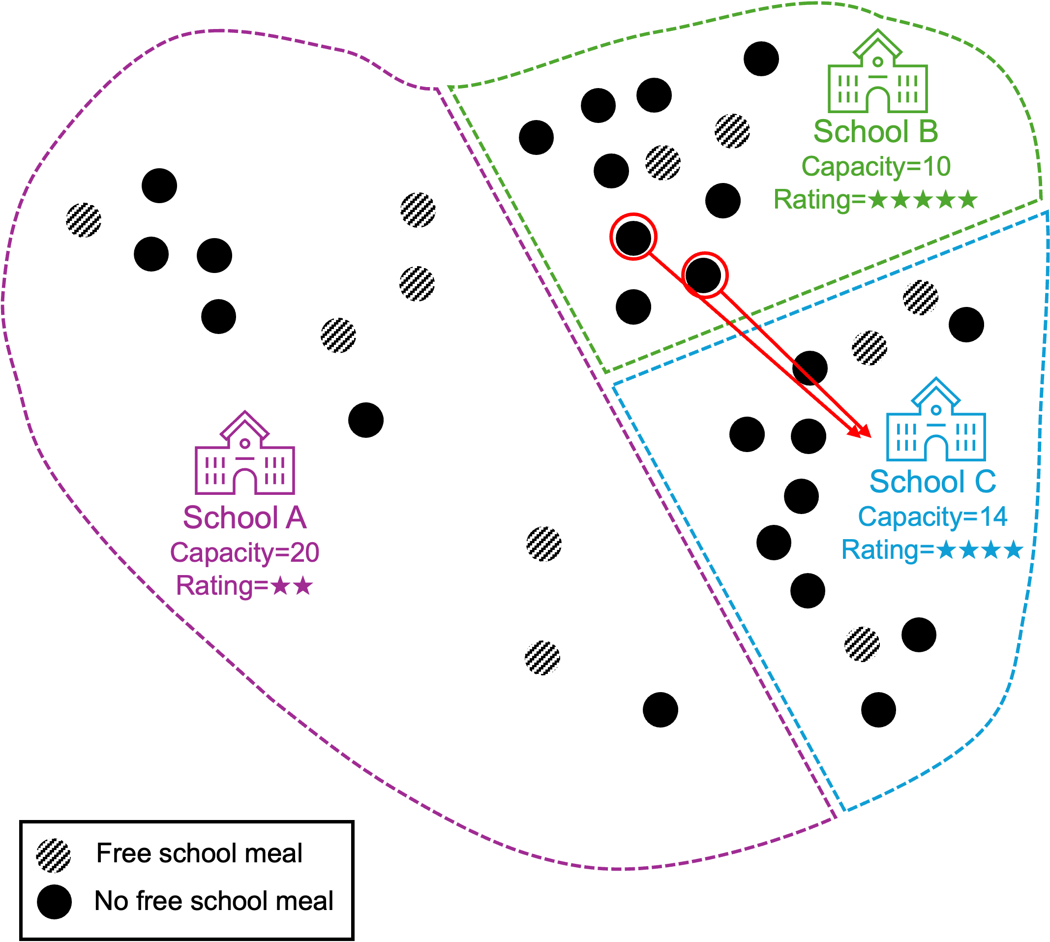
Free School Meals and Excess School Capacity
The council are, laudably, trying to improve the opportunities for pupils eligible for free school meals by distributing the pupils more evenly through the city. One way they’ve been trying to do this is by introducing a new rule for how schools accept pupils, whereby pupils eligible for free school meals get first dibs on their school of choice. However, due to the way excess capacity is distributed across the schools in Brighton, it will potentially only lead to already less popular schools becoming less popular still.
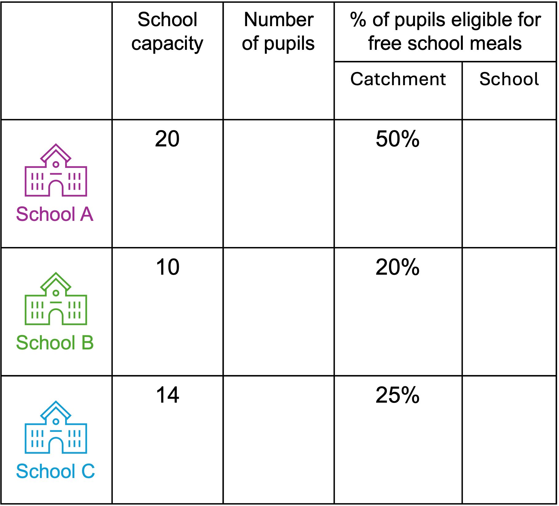
The best way to explain this is with another simple example. Let’s suppose we have a city with three schools and three catchments. Each dot on the map represents a pupil entering secondary school. The schools have varying capacity (equivalent to the PAN), and varying levels of popularity (denoted by stars) which could be thought of as reflecting school outcomes, or OFSTED rating, or geographic location.
School A is in the suburbs of the city. School B and C are in the centre of the city, in more densely populated areas. School A occupies a large site, with a large capacity for pupils, perhaps it was built in a period of high demand due to lots of families moving to the immediate area.
Now suppose this area around school A is now less densely populated by families, for example there might be an ageing population in this area. Simultaneously due to inequalities in the city, the distribution of pupils eligible for free school meals in not even across the city, for example perhaps due to rising rent prices in the city centre, lower income households have had to move to the suburbs – contributing to higher rates of pupils eligible for free school meals in this area.
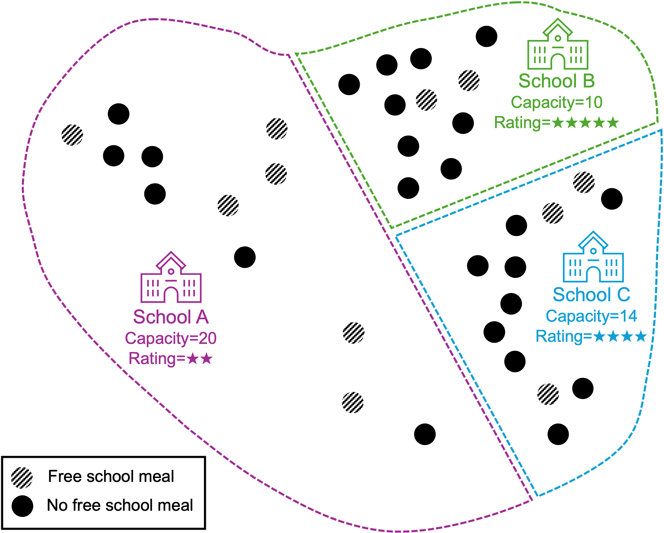
Now lets think about how these pupils might be assigned to secondary schools in the city. Prior to assignment we have:
Now lets assume the school admits pupils according to the following rules, until the school’s maximum capacity is reached:
Rule 1: the school admits anyone who has chosen the school AND gets a free school meal.
Rule 2: The school admits anyone who has chosen the school AND lives in the catchment area.
Rule 3: The school admits anyone else who has chosen the school.
I’m going to make one final assumption that for ~90% of pupils their first choice is the school they are in the catchment for.
So according to Rule 1, we start by looking at where pupils eligible for free school meals go to school. Let’s assume that all pupils would normally choose the school they are in the catchment area for. However, under the new rule, which allows pupils eligible for free school meal to attend any school in the city, 2 pupils in the catchment for school A elect to attend school B instead.
After rule 1, School A has an intake of 4, School B an intake of 4, and School C an intake of 3.
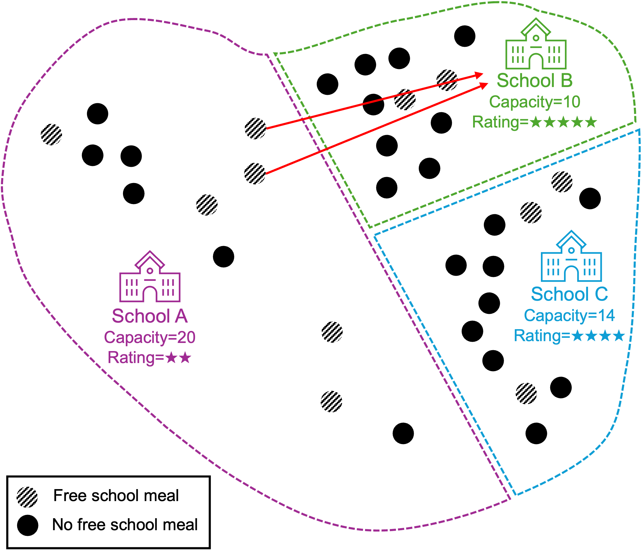
Let’s assume all other pupils want to attend the school in their catchment area. School A has 16 places remaining, and admits the 6 remaining pupils in its catchment who chose it -resulting in 10 pupils total.
School B has 6 spaces remaining, it randomly admits 6/8 pupils from it’s local area before reaching capacity. This leaves 2 pupils whose school is yet to be determined (highlighted in red below).
School B has 11 places remaining, and admits the 9 remaining pupils in its catchment – resulting in 12 pupils total.
Returning to the two pupils whose school in undecided - School B is completely full and can no longer admit students, however School A and school C still have capacity. Since school C is almost as good as B, as well as being nearby in the city centre, these pupils elect school C – resulting in 14 pupils at school C.
Now looking at the table from earlier again:
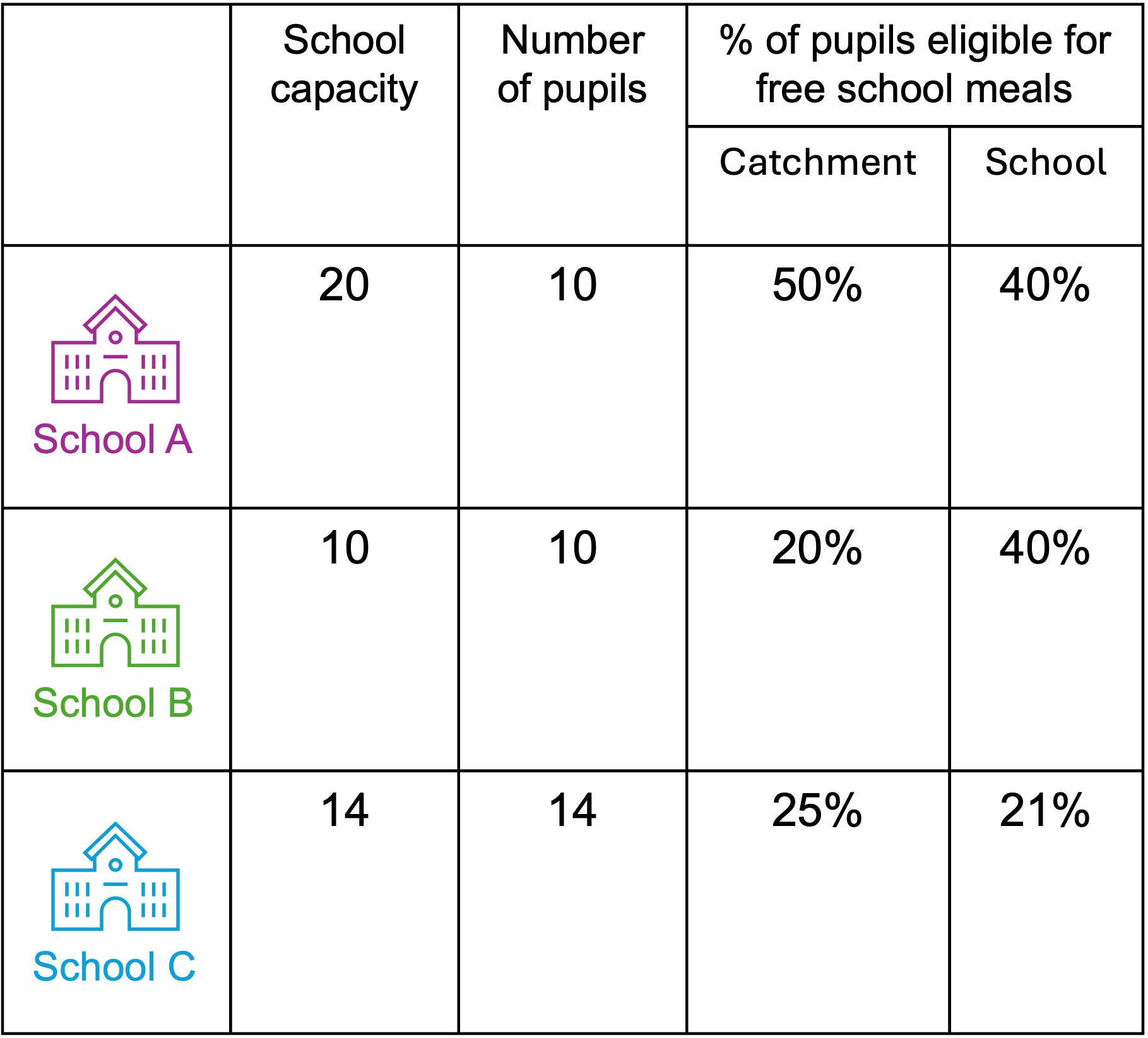
In this example situation, both schools B and C have reached capacity. School A and B have a more equal distribution of pupils eligible for free school meals, but the percent of pupils eligible for free school meals has decreased at school C, since it has had an influx of pupils not on free school meals.
Now, in terms of excess capacity, this all lies in school A, it has filled just 50% of its potential capacity. When given a choice, pupils move to the better schools, or failing that the next best school until they reach capacity.
This is a really simplified example. How the school allocates places is more complicated. Consider the rule for children eligible for free school meals – the actual rule states that ‘the number of places in this priority are limited so that the school has no more than the average number of free school meals children attending.’
Brighton and Hove - Demographic Patterns
History and Futures
One question that keeps coming up relates to what the school population of Brighton is going to look like in the future.
While, as I showed in my last piece, it’s fairly certain from ONS projections that the city is going to lose quite a number of young people over the next decade - maybe a couple of thousand - what is not clear is how that will play out across the city. Will it be an even decline, or will some places suffer worse than others?
The Office for National Statistics produces a number of data products. Firstly a product called the LSOA population estimates - these are small-area estimates for neighbourhoods and can be examined back in time to look at past changes.
The second product is called the sub national population projections - these don’t quite go down to the LSOA level, but are available at the local authority level and go a number of years into the future.
What is noticable is the relative distributions of the LSOA populations don’t change that much over time, so we can use the distributions in the past estimates, to apply to future projections to create a full neighbourhood-level picture of Brighton for a 20 year period.
One of my colleagues, Dr Andy Maclachlan, has created an interactive map where you can explore the period from 2011 until 2031 for the city. https://amaclachlan.shinyapps.io/Brighton_school_children_catchments/ - all data have been downloaded from the ONS via the NOMIS website.
An alternative view of Andy’s interactive map can be seen in the maps and the plot below.
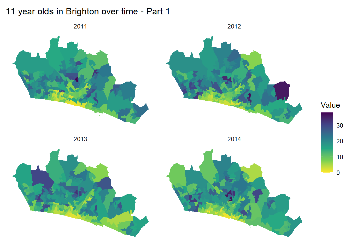
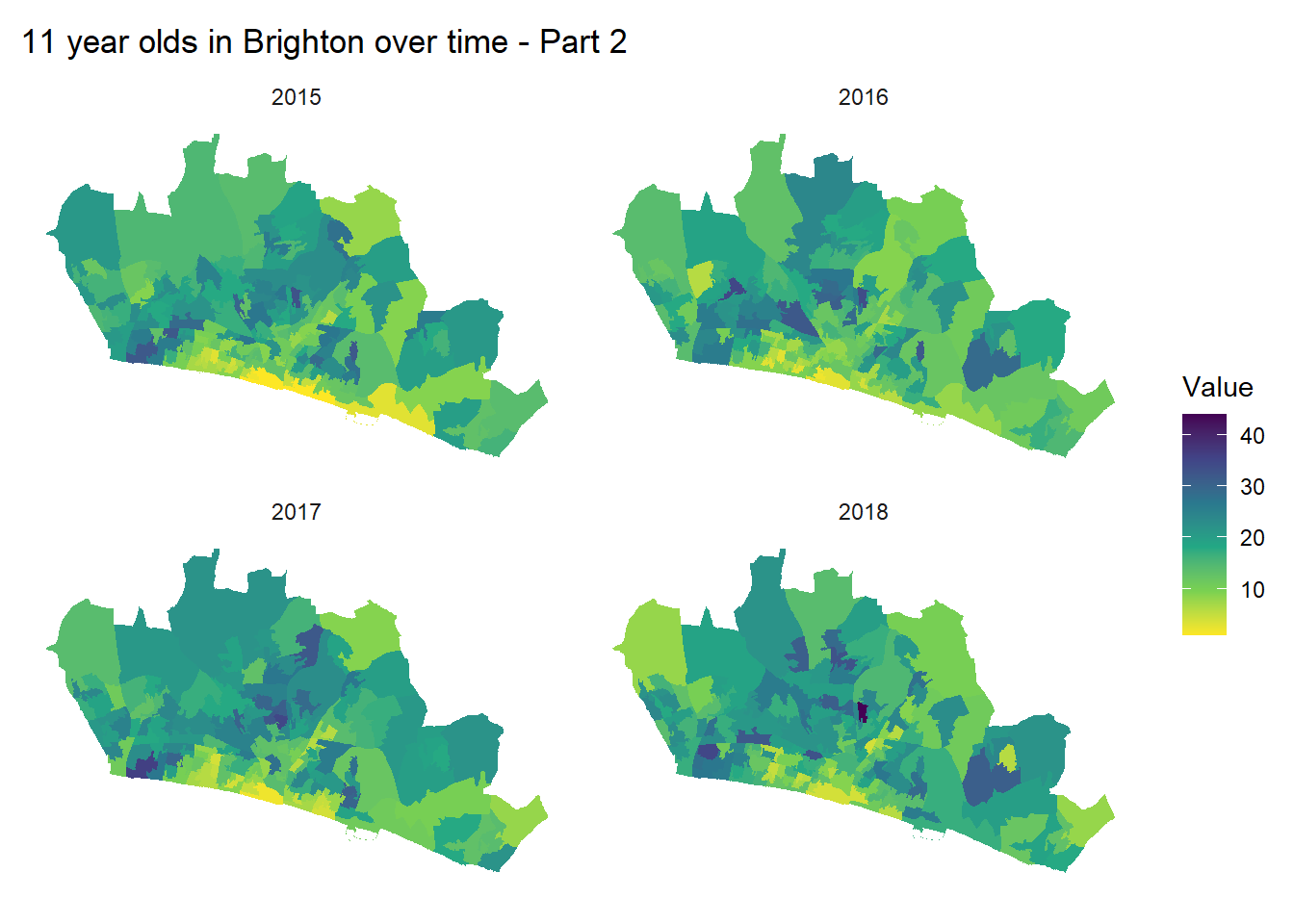
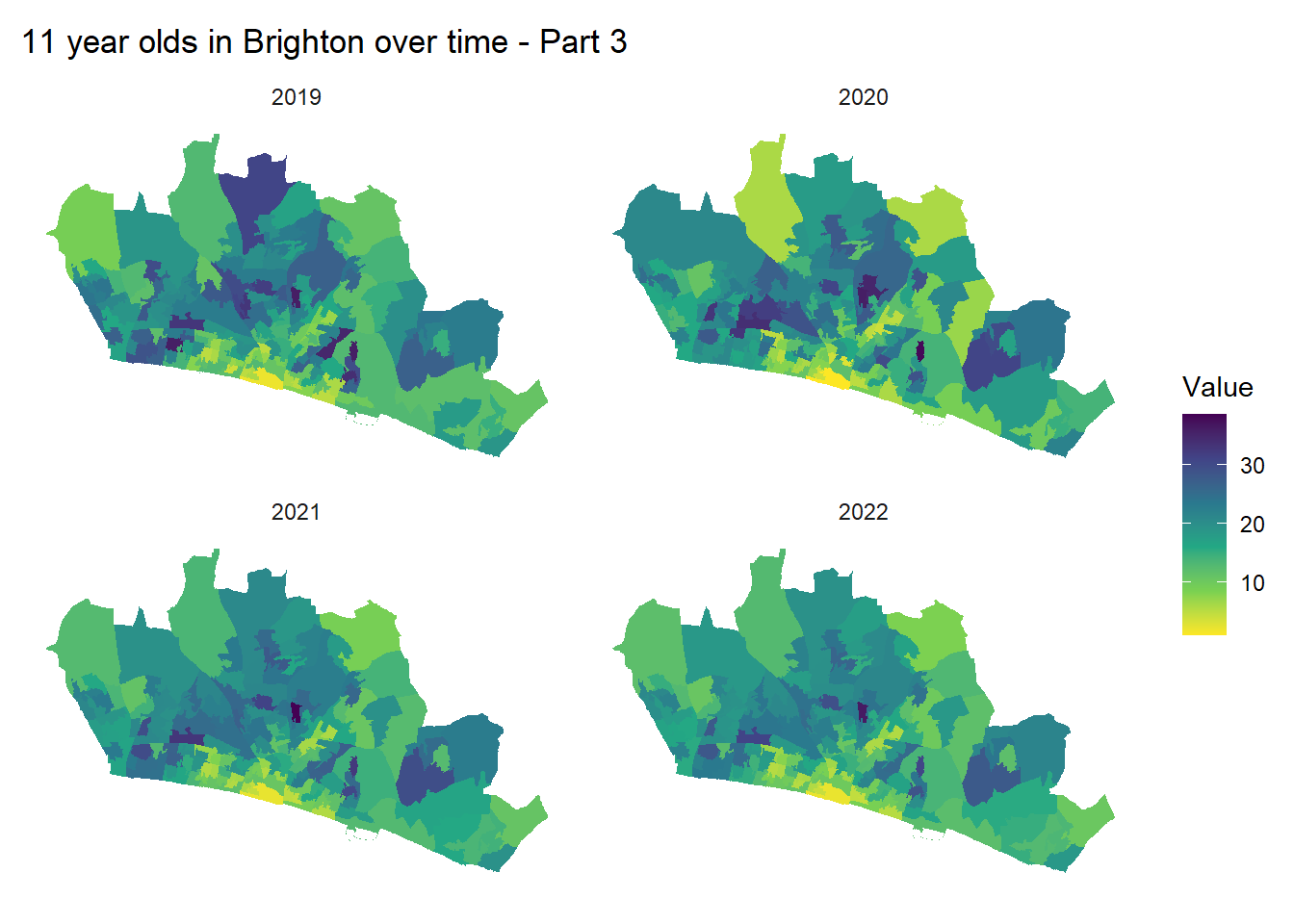
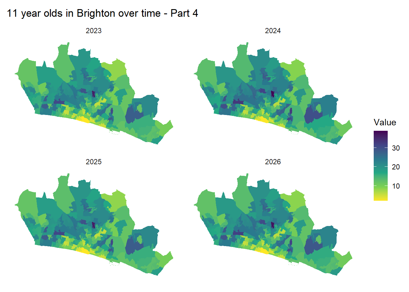
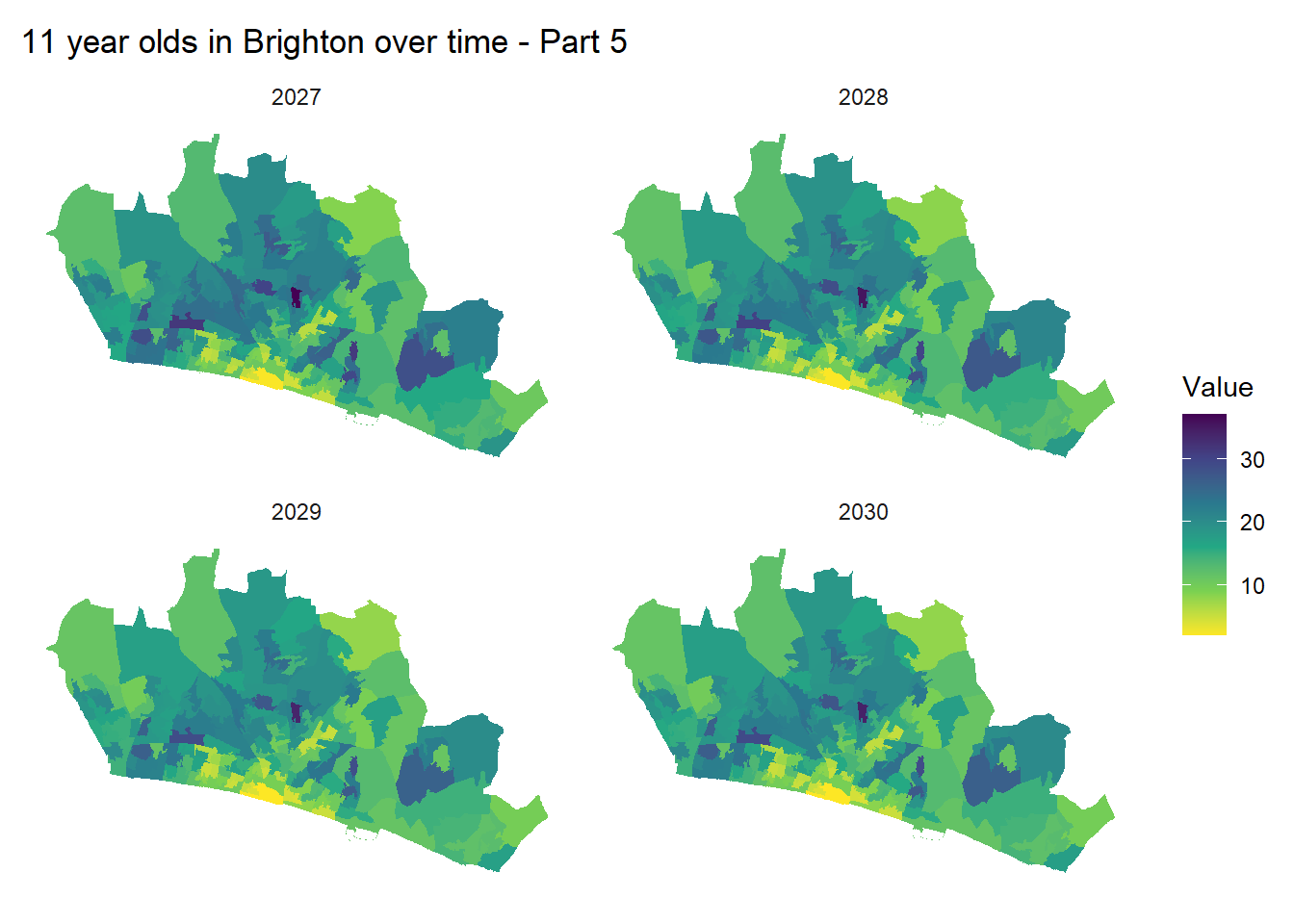
One thing to point out is that while numbers in a given neighbourhood may fluctuate a little (a corner of woodingdean had high numbers of 11 year olds in 2012, which have dropped off since), you can see from the maps that, areas don’t change very much relative to each other.
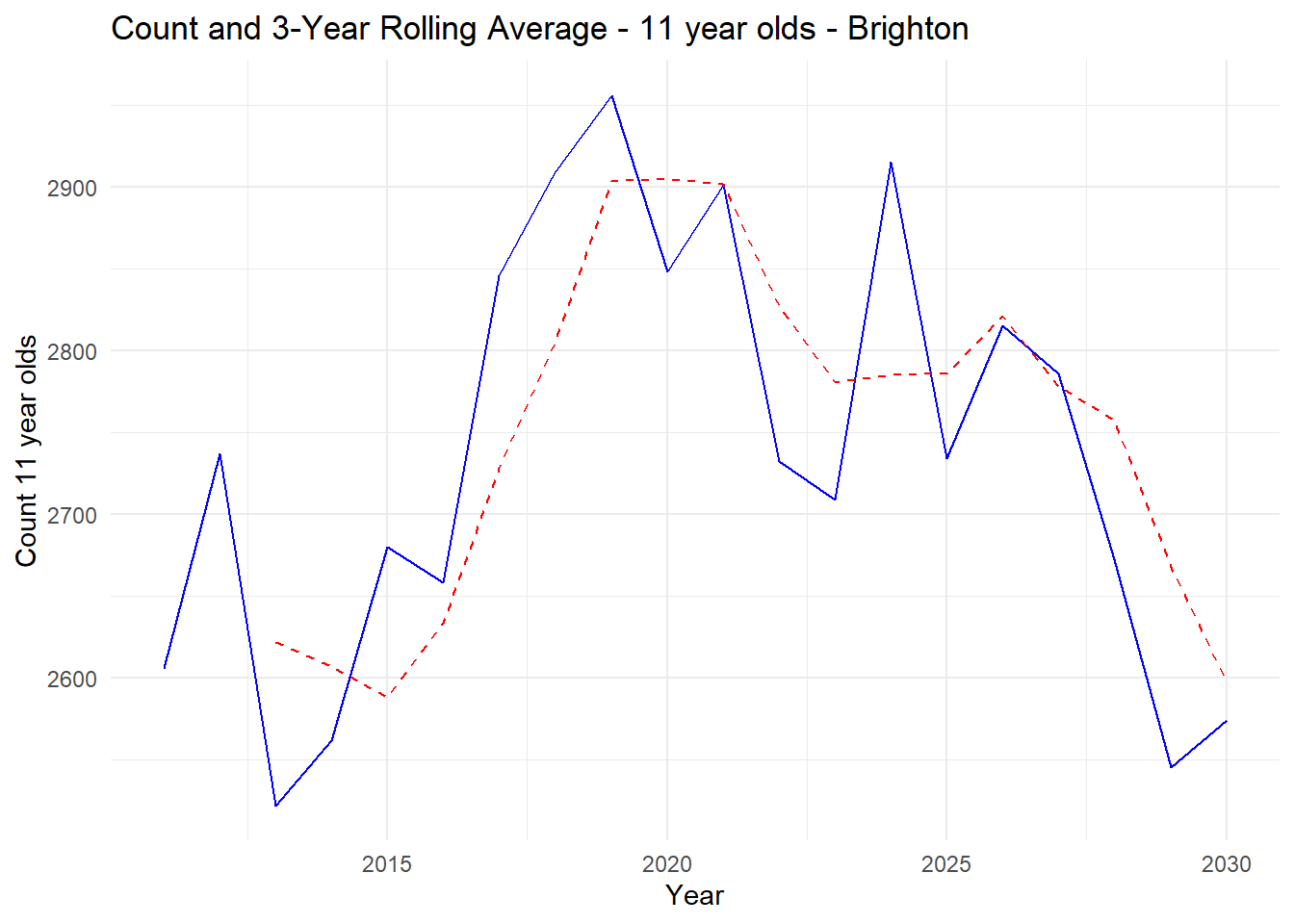
In the graph, we can observe that between 2011 and up to 2031, the number of 11 year-olds in the city hit a peak in 2019 with another small peak in 2024, but there is a projected decline of 200-300 students until 2030.
Demographic trends are long term generally, so the patterns for schools which draw from large parts of the city, can be fairly predictable. In the East of the City, for example, the interactive map shows that in the ‘Deans’ most LSOAs (except for one between Ovingdean and Woodingdean, which might be around 5 11 year-olds higher in 2031 than in 2011) there is nothing to suggest anything other than the same decline experienced elsewhere in the city.
One issue with standard choropleth maps such as the ones above, is that there are visual distortions created by the large amounts of green space in parts of Brighton. Open spaces makes zones based on population (like these LSOAs) physically larger which draws your eye to. A truer picture of actual demographic distribution in the city can be seen in maps like the one below.
Demographic Distribution and Catchments
The crucial thing in Brighton, however, relates to the spatial distribution of school age Children relative to catchments. I posted this map a few days ago and also at the top of this piece, but now I have allowed the different options A, B and C (as well as the current situation described as OptionX in the map to be overlaid.
If you play with the layer options on the left you can see how distributions of catchments vary according to the different catchment options.
Figure - - The spatial distribution of 11 year olds in 2024, relative to current secondary school catchment boundaries.
The circles relate to LSOA neighbourhoods in the city. The numbers relate to the 2024 sub-national population projections at City Level, distributed down to LSOAs using the last know recorded distributions in 2021. There is bound to be some error, but as you will see from the historical 2011 to 2021 patterns shown above and on the interactive site, demographics are stable enough to be confident this is a pretty fair representation of the real distribution of 11 year olds.
Normally these sorts of data are shown on a choropleth map of contiguous zones, but here I have chosen to take the population-weighted centroids of the LSOA zones and scale those centroid locations according to estimated numbers of 11-year olds. In doing this, the distorting effects of open space are controlled for and a truer picture of the real population distribution in the city can be gained.
Overlaid onto this map are the current and proposed secondary school catchment boundaries in the city.
It becomes very clear that most catchments are well populated although the BACA catchment in the north-east of the city appears to have a low population within its boundary. This is born out in the analysis I conducted in my last piece.
The other thing to note is how sparse the Longhill Catchment to the East is, with it clear that other than a small concentration of children to the north in Woodingdean, the majority of the catchment population is made up of children coming from Whitehawk to the West. Without those children from Whitehawk, it would be difficult to see Longhill having enough children to keep running in its current form.
Option B and the inevitable mass-transfer of children from Central Brighton to the East
One of the inevitable consequences of the rearrangement of the Catchment areas and in particular Option B, is the certain transfer of large numbers of students from Central to East Brighton on a daily basis (along with some counter-currents in the opposite direction).
Looking at the map above, it’s possible to use the estimated numbers of children in 2026 as an example.
Dorothy Stringer, in the North West Corner of the South Brighton Catchment, is proposed to have a PAN of 300 in 2026
Longhill a PAN of 240
If we assume anyone close to DS is going to put that as 1st choice (geographically and as it is a good school), moving South and East away from DS, they fill up their PAN by just the other side of Queens Park - 292 Yr 7 children north and west of Sutherland Road.
Between there and the Marina, there are about 146 Children - mainly in Whitehawk.
If we assume everyone East of Woodingdean picks Longhill (we know they won’t, but useful for now), we get to 180.
Even if just 50% of children from the area including Whitehawk pick and get offered DS (it will probably be more due to FSM proportions being high there). That’s 73 children just in yr 7 who live West of Queens Park, who would be forced to travel to Longhill. And that’s a conservative estimate.
Propagate that through for 5 years after the policy implemented and you’ve got something like 365 children a day having to travel from East of Queens Park, across the city to get to school.
If a bus has a capacity of around 80. That’s 5 buses to take all of these children east.
To an extent, this is back of the envelope stuff, but at least gets us to some sort of number for the level of commuting. 50% of those journey’s by car? Get e sense of the level of traffic disruption it would cause.
Conclusions
Long-term demographic trends in the city show that we are indeed heading into a demographic decline in school children in the next decade. However, this decline is not felt the same across all places in the city.
Sparsity and decline are additional factors which are making Longhill, at its current size and in it’s current location, a challenging school for the council.
At present, only Option B would result in the transfer of students required en masse to the East of the City, to keep the status quo in this school. A conservative estimate would be that if the policy is in place for 5 years, this might lead to a minimum of 365 children a day travelling from central Brighton to the East of the City.
- How is this a sustainable or indeed affordable option for the Council?
I have focused on South Brighton in this example (I am running out of time and steam) but the situation might be even worse in North Brighton with students moving around between three schools in the catchment. This would lead to hundreds more children bussing around the city.
- Again, how is this a sustainable or indeed affordable option for the Council?
Review of the Last 3 Weeks
Since the announcement of the ‘engagement exercise’ by the council, and frustrated by the evidence made available, I have made it my mission to try and fill the information vacuum with data and evidence collated, analysed and presented from a variety of different sources.
Hopefully this week, alongside my other two pieces of analysis (here and here), have helped highlight where the real issues in the system are. These can be summarised as:
The spatial distribution of schools and places available in those schools, relative to where pupils actually live. Some (well, one as we’ll see below) of the schools in Brighton are simply in the wrong place (piece 1).
Illogical reductions in Published Admission Numbers for some schools and the maintenance of other, relative to current and future demand, driven largely by a desire to artificially prop up a school of the wrong size in the wrong location (piece 2).
Unfortunately, the effort taken in digging through the data and to unearly these issues means that I’ve not yet been able to address some of the other crucial parts of the story. In particular:
- The fact that the educational disadvantage partially caused by the spatial arrangement of current schools, is most keenly felt by those in the city who unfairly suffer from other forms of social and economic disadvantage - in particular residents of Whitehawk whose access to secondary education is poor. The issues raised by Class Divide around the closure of the COMART school in East Brighton in 2005 and their subsequent lack of accessibility to ANY secondary education in the city, let alone high-quality education, is very real.
But in not being fully honest about all dimensions of problem - or possibly just ignorant of them - and in trying to portray the whole of the Brighton schools system as a problem, and a narrative of the ‘middle classes’ of north Brighton closing ranks to thwart a just cause (rather than a fundamentally flawed process), the whole community has been let down by the Council. I am now even more strongly of the opinion that the ‘solutions’ on the table are nothing of the sort and will only serve to do more harm than good.
My Current Fears - I hope unfounded
At the beginning of the exercise, I had real hope that the lack of information coming from the council was perhaps a mistake - an oversight due to an inexperienced or over-worked team. Unfortunately, as the weeks have gone by, and as I have listened to members of the council during the ‘engagement’ Q&A sessions, the council are giving the impression that the lack of information is intentional. By not engaging with the requests for information and the clearly articulated fears of the community - and at worst, being dismissive of them - it feels like they have already made up their minds. It feels like an engagement in name only. I hope this is not the case.
Having reviewed all of the data I have gathered, it has become clear that only one option on the table - Option B (or something which looks a lot like it) - will result in the mass transition of students from the centre of the City, to Longhill in the East. A school which while once an appropriate size for a catchment stretching out towards Peacehaven, thanks to long-term demographic shifts (an ageing population and decline in families) no longer serves its original constituency. In recent years it’s cohorts of students have been swelled by children bussed out from Whitehawk in the East of the City - a demographic sticking plaster made easier to apply thanks to a population with less financial and social capital to resist.
To its credit, the Council - if not quite able to own up to its failures in closing COMART in 2005 - at least is now listening to that part of the city and has enacted a new policy to allow the financially worst off students - those on Free School Meals - to choose to study elsewhere in the city, should they wish. However, it’s clear that Option B is also the only option that stands to mitigate the inevitable effects of this policy, which will lead to still more students deserting Longhill. A policy that, if the council do rush through with a consultation immediately after the engagement period ends, won’t have had time to come to fruition or the initial results to be reviewed. It can be the only explanation for the haste with which council is proceeding.
I fear that in all of this, if the council pushes forward against the increasing weight of evidence, the people they are supposedly championing - those particularly in Whitehawk - will actually lose out in the long term. This is because, as I will show in some new analysis below - Longhill is poorly located and will continue to be poorly located, relative to where pupils live in the city. The council may try to argue that a new housing estate in Ovingdean will generate the demand required to keep Longhill afloat in the medium term, but as the numbers show below, unless this estate is the size of something like Whitehawk (it is far from that) it will be a drop in the ocean and barely move the dial. And the distraction of making a bad catchment system even worse, means that a real, sustainable, long-term, solution will be kicked down the road in favour of a poorly thought through short term solution, which is unlikely to work anyway.
My Hopes
On the plus side, it is not too late for the council to take notice of the hundreds of good ideas and suggestions that are now emerging from individuals and self-organised groups in the city. I hope that they really do listen.
I hope that some of the evidence I have provided to fill the vacuum has helped some people understand what the underlying problem is a little better. And that armed with this information, they have felt emboldened to pose good questions to the council and make their voice heard.
I hope that the council takes the city up on its offer of help, whether through a Citizens Assembly, through the offers of help from experts who live in the city and care about it deeply.
In my last piece I offered the council a viable option which would allow them to slow down and take an evidence-based approach. Myself and other members of the newly formed Parent Support Group intend to present the council with a worked through alternative to their current plans - and “Option D” if you like which will offer both a short-term and longer term sustainable alternatives to those that are currently on the table.
I hope that our proposals do buy the time the Council needs to do this properly. In my last piece I called for a systems thinking approach and I think this is the only way a lasting and sustainable solution can be reached. This will need to be carried out with a full range of view gathered from a Citizens Assembly - and idea I have seen recently promoted by Class Divide and one which was put to the council the last time they tried to re-draw the catchment boundaries, but one which clearly has not been enacted yet. And the council need to engage with a diverse and full range of expert views. It is great that the view of Prof Gorard and Dr Greaves were heard, and their educational perspective is important, but as I have shown this is as much a problem of geography and community, of flows and interactions, as it is of education. And there are hundreds of other voices with equally important perspectives that need to be heard.
Adam Dennett 22/10/24